OUGD501: Context of Practice 2 - Study Task 2 // Consumerism Aston Martin Analysis


The advert depicted above is that of Aston Martin, a high performance, super car manufacturer, based in the UK. Aston Martin produced this advert to promote and re-home their used Aston Martins. This advert reflects the logic of consumerism; it does so by tapping into our suppressed irrational desires, as spoken about by Sigmund Freud. The idea that we all have hidden primitive sexual forces and animal instincts, which need controlling, hidden, suppressed by society. The advert does so by suggesting, quiet blatantly, that the woman in the ad is a sexual object, ‘you know you’re not the first, but do you really care?’, something which can stimulate you, a personification of an Aston Martin, you expect a thrill from her. This is supported by Berger, J. in 'Ways of Seeing’, where he write 'One may remember or forget these messages but briefly one takes them in, and for a moment they stimulate the imagination by way of either memory of expectation.’ (Berger. J, 1972, p129) - this car, like this girl, is an experience, it doesn’t matter that you’re not the first, as long as you’re experiencing it. It also implies that this car is supposed to pleasure you, like a woman would when engaging in sexual acts. This is once again referred to ‘Publicity is effective precisely because it feeds upon the real. Clothes, food, cars, cosmetics, bathos, sunshine are real things to en enjoyed in themselves. Publicity begins by working on a natural appetite for pleasure’. (Berger. J, 1972, p132) This texts also communicate the envy associated within the ads, almost like bragging rights, as some males, who are indeed the target audience for this advert, do tend to boast about their sexual encounters, in an 'alpha male’ style. Something, which could also be done with an Aston Martin, as apposed to a 2003 Fiat Punto. Transforming you into the man you want to be, which could either be with a fantastic looking female, or even an Aston Martin. ‘It proposes to each of us that we transform ourselves, or our lives by buying something more…it will make us in some way richer — even though we will be poorer by having spent our money.’ (Berger. J, 1972, 131). You could also suggest that whoever has used the Aston, or spent time with the model, have had an enriched life 'Publicity persuades us of such a transformation by showing us people who have apparently been transformed’ (Berger. J, 1972, P131). You could also argue that not only is an Aston Martin a commodity which acts as a status symbol, making you accessible to women, without it, you are nothing, as suggested by the association between the model and the car, this is supported by Berger; ‘If you are able to buy this product you will be loveable. If you cannot buy it, you will be less loveable’ (Berger. J, 1972, P144). Ultimately, tying the ownership of used Aston Martin to that with intercourse with an attractive woman. 

Bibliography

1. Berger. J (1972) 'Ways of Seeing' BBC and Penguin Books Ltd, London 

OUGD503: Studio Brief 1 - Individual Practice // Selecting 5 Competition Briefs

As part of this task, we were asked to select 5 competition briefs, which we had to print out and bring to the session. You can see the 5 briefs below.


Typography Day will be organised for the seventh time on 28th Feb, 1st, 2nd March 2014 at the Symbiosis Institute of Design, Pune (India) in collaboration with the Industrial Design Centre (IDC), Indian Institute of Technology Bombay (IIT Bombay) with support from India Design Association (InDeAs) and Aksharaya.

The event will feature a day of workshops on Typography and Calligraphy followed by two days of conference dedicated to ’Typography and Culture’. The international conference will be devoted to addressing issues faced by type designers, type users and type educators.

Beside workshops and conference, Typography Day will also host a poster design competition. The theme for the poster competition is "Across Opposites". Design a poster to express two opposite or conflicting meaning words (antonym). Each of these words should be from a different language. You can make use of two different types faces from two different cultures.

Calligraphic or digitally created letterforms or existing fonts, or a combination of these can be used for the poster. Size of the final poster: 420mm x 600mm only in portrait format. Resolution: 300 dpi - File type: JPEG or PDF - Color Mode: CMYK.

Each participant is allowed a maximum of three entries.

There is no entry fee.

Eligibility // This competition is open to students, faculty and professionals all over the world.

Prize // Twenty five winning entries will be published and displayed in an exhibition during the event. The winners are entitled to free participation (workshop expenses and food) during the Typography Seminar and Workshop on 28th Feb, 1st, 2nd March 2014

http://www.graphiccompetitions.com/graphic-design/typoday-2014-poster-design-competition


If point of impact of the early-1990s grunge explosion can be traced to Nirvana's Nevermind, the full commercial arrival of rap-metal can be pinpointed to August 1998 — the month Korn's aptly titled third album, Follow the Leader, debuted at Number One. The two-time Grammy Award winning band is now celebrating the recent launch of their latest album The Paradigm Shift which was recorded with producer Don Gilmore of Linkin Park.

In celebration of the album release, Korn are inviting aspiring designers to submit a design inspired by their new track Love & Meth for the chance to become the official artwork for the single.

Korn's Choice
One winner will have their design produced and featured as the official artwork for Love & Meth. In addition, the winner will receive:

One custom Korn guitar (valued at $225) signed by the band
Limited edition lithograph of the winning design, signed by the band
Exposure for their design across Korn's social media channels
A deluxe version of The Paradigm Shift
Two tickets to a Korn tour date closest to the winner's location, with access to meet the band (travel and accommodation are the responsibility of the winner)
$500

People's Choice
One highest-voted winner will receive:

An exclusive Korn merchandise package including a signed poster
Two tickets to a Korn tour date closest to the winner's location (travel and accommodation are the responsibility of the winner)
Exposure for their submission across Korn's social media channels

Get Involved

Launch: October 28, 2013

Submit by: December 4, 2013
Vote: December 5, 2013 - December 11, 2013
Winner(s) Announced: December 19, 2013

(Disclaimer, I haven't listened to Korn since I was 15, I had a fringe). http://www.talenthouse.com/design-for-korn


Chris Stapleton released his new single "What Are You Listening To?" this summer. However, this is only the beginning, as September 24th marked the beginning of his tour. Check out his tour dates here. This country artist instantly grabs the attention of his audiences with his outstanding voice, as he has been described by artists including Adele and Sheryl Crow as the best voice in Nashville.


Chris and Universal Music Group Nashville (UMGN) are inviting the Talenthouse community to create a poster design that captures the soul of his single "What Are you Listening To?" Listen to the lyric video on the right and download the sticker below for inspiration. You may use the picture of Chris in your design available for download below, but it is not required. This is a unique experience that provides the opportunity to design for the best voice in country music!

Chris Stapleton's Choice

One grand prize winner will receive:

$1000
A Chris Stapleton merch pack
The host's choice will be featured across Chris Stapleton's official Facebook and Twitter.

People's ChoiceThe highest voted winner will receive:

$250
The highest voted will be featured across Chris Stapleton's official Facebook and Twitter.
Get Involved

Downloads:
Chris Stapleton Picture.jpg
Retro Whiskers Sticker.pdf

Launch: October 8, 2013
Submit by: November 12, 2013
Vote: November 13, 2013 - November 20, 2013
Winner(s) Announced: November 28, 2013
All phases have a deadline of 10am PST

http://www.talenthouse.com/design-for-chris-stapleton


Your design for the coffee revolution! Bonaverde is a small, dedicated team of young, sleepless Berliner entrepreneurs that made it their goal to revolutionize the world of coffee. Around 2 years ago, Hans the founder started out with a vision: build the first all-in-one coffee machine in the world that would not only grind and brew, but alsoROAST coffee.

There are many benefits in having freshly roasted coffee, but probably the most groundbreaking thing about it is that you’ll get the raw beans directly from the farmer. You skip the currently up to 17 steps between the farmer and yourself, and gain complete transparency on your coffee bean’s value chain. And it also means that farmers finally get more for their beans.

Now it’s time for implementation. The technique is all set up but still lacking a beautiful housing. Bonaverde needs you to make this very first roast-grind-brew coffee machine an object to long for by creating the most spectacularly simple yet elegant product ever seen in a kitchen.

This contest also runs in combination with an upcoming Kickstarter campaign. So if your design is selected to be the best, it will get featured on Kickstarter as the machine design most likely to be produced. And if it’s produced, you won’t fall short off royalties.

There is no entry fee.

Eligibility

The competition is open to everyone worldwide.

Prize

The total prize money is 6,000 Euro (approx. 8,200 USD) split amongst the winners. The Early Bird winner (by October 30th) can literally make history by designing the next disruptive innovation that people from all over the world will long for.

However not only fame, but also serious financial benefits can come his way: 0.80 Euro royalties per machine could get him very far once we start serial production. Still, the project is far from being over after you’ve selected the Early Bird Winner - all other Community Winners stand the chance of being licensed and produced if they convince the crowd.

http://www.graphiccompetitions.com/multiple-disciplines/brave-new-coffee-world-design-competition

Grand Cigars


http://99designs.co.uk/logo-design/contests/create-logo-grand-cigars-256223/brief


OUGD501: Context of Practice 2 (Lecture) - Identity

james.beighton@leeds-art.ac.uk

Lecture Summary
  • To introduce historical conceptions of identity
  • To introduce Foucault’s discourse methodology
  • Yo place and critiquer contemporary practice within these frameworks, and to consider their validity
  • To consider postmodern theories of identity as fluid and constructed.
Theories of Identity
  • Essentialism (transitional Approach)
  • Physiognomy
  • Cesare Lombroso (1835-1909) - Founder of positivist criminology - the notion that criminal tendencies are inherited.
Phrenology
  • Physiognomy legitimising Racism.
  • Anglo-teutonic,
  • Irish Iberian
  • Negro
  • Hieronymous Bosch (1450-1516) Christ carrying the cross, llid on panel, c. 1515. 
  • Chris Ofili, Holy Virgin Mary, 1996. - suggesting that mary was something other than the blond hair blue eyes stereotypical beauty.
  • Historical Phrases of Identity 
  • Douglass Kellner - Media culture: Cultural Studies, Identity and Politics between the modern and the post modern, 1992.
Pre-Modern Identity
  • ‘secure identities’
  • Farm-worker,
  • soldier
  • factor worker,
  • housewife
  • gentleman,
  • husband-wife (family)
  • landed gentry
  • the state,
  • industrial capitalism
  • patriarchy
  • patriarchy
  • marriage church
Modern Identity 19th and earth 20th Centuries
  • Charles Baudelarie - The painter of Modern Life (1863)
  • Baudelarie introduced the concept of the flaneur (gentlemen stroller)
  • Veblen - conspicuous consumption of valuable goods is a means of reputability to the gentlemen of leisure
  • Gustave Callibeotte (1848-94)
  • Le Pont de l’Europe 1876
  • Not having to work is an indication of your class
  • Simmel - Trickle down theory, Emulation, Distinction, the mask of fashion
  • Gustave Caillebotte (1848-94
  • Paris Street, Rainy Day, 1877.
  • Georg Simmel
  • The feeling os isolation is rarely as decisive and intense when one actually finds oneself physically alone, as when one is a stranger without relations, among many physically chose personal at a party on the train or in the traffic of a large city. 
  • Simmel suggests that; because of the speed and meltability of modernity -.-
Post-Modern Identity
  • Discourse Analysis
  • Identity is constructed out of the discourse culturally available to us. 
  • What is discourse?
  • 'A set of recurring statements the deinf e particular cultural object, eg. madness, ciminallity, sexuality, and provide concepts and terms through which such an object can be studied and discussed' Cavalaari (2001)
  • Possible Discourses
  • Cass
  • Nationality
  • Race/ethnicity
  • Gender and Sexuality
Class
  • Humphrey Spender/Mass Observation, Worktown project, 1937
  • To know where you fit in, you need to know what the other classes are. 
  • Set up by Spender, a social anthropologist, to observe Britain living. 
  • Documented in Bolton - mass observation.
  • Martin Parr, New Brighton, Merseyside, from The Last Resort, 1983-86
  • Condescending way of viewing lower classes. 
  • Perpetuationing a stereotype of a different class. 
  • Martin Parr, Ascot, 2003,
  • Society reminds one of a particularly shrewd cunning and pokerfaced paler i the game of life, cheating if given a chance flouting rules whenever possible. 
Nationality
  • Martin Parr, Sedlscombe from Think of England 2000-2003
  • Cultural appropriation
  • Las Vegas - is American a real identity? Fake, replicas, taken from other nationalities.
  • Disney World, all the con ties are much closer together.
  • Race/Ethnicity
  • Icons being depicted as in a different light, the holy virgin Mary being black, for example. 
  • (Chris Ofili, Captain shit and the Legend of the Black stars, 1994)
  • Chris Ofili No Woman, No Crime 1988
  • Gillian Wearing, from the signs that say what you want them to say and not signs that say what someone else wants you to say, 1992-3
  • Representation of black people, models being used in provocative nature. 
Gender and Sexuality
  • The fashion industry is not the work of women, but the work of men.
  • gigantic unconscious hoax.
  • Flapper, 1925
  • Androgyny 1920’s style, from Punch Magazine.
  • Masquerade and the mask of femininity
  • Cindy Sherman, Untitled film stills, 1977-80.
  • Sam Taylor Wood, Portrait (Fuck, Suck, Spank, Wank, 1993
  • Sarah Lucas, Au Naturel, 1994
  • Tracey Emin, Everyone I have eve slept with 1963-95, 1995
  • Wonderbar - women shouldn’t be stereotyped to the kitchen
  • Gillian Wearing, Lynne, 1993-6
Post Modern Theory
  • Identity is constructed through a social experience
  • Erving Goffman The Presentation of Self in Everyday Life (1959)
  • Zygmint Bauman - Identity (2004), Liquid Modernity (2000), Liquid Love (2003)
  • Yes, indeed, identity is revealed to us only as something to be invented.
  • Rene Decartes (1596-1650) - I think therefore I am
  • I shop therefore I am - Barbara Krunger

OUGD501: Context of Practice 2 (Seminar) - Comsumerism

Lecture Recap:
  • Freud - Instinctual desires, 'pleasure principle', when satisfied you become docile. Incompatibility with humanity and society. 
  • Bernays - Consumption satisfies the desires, we're made to think we're happy, so we're docile. As we believe our desires have been met. 
  • Social Control - Using the consumer system, keeping people passive and docile, people are less likely to start a revolution. 
  • P.R. - Commodities, society to people - a false need.
  • Fordism - Mass production, an execration of the amount of things available - Because of it's nature it produced disposable income, which increased consumption. Which lead to brand rivalry. (1920's)
We then were asked to pick out some key phrases, which supported the idea of consumerism in the text below, click to zoom!


OUGD504: STUDIO BRIEF 1 - WHAT IS DESIGN FOR PRINT? // Commercial Costing

When defining the cost for commercial printing you must take into consideration a few several factors. I looked at a printers website, to see how their costing is spread out, how it works. Of course, getting actual figures would be useless, as each individual printers will have different rates.

Size
The first factor which you must consider is the size of the stock, in relation to the amount of ink applied. For example, if you were to print on 45 leaves within an A5 publication single sided it would be [x], however, if you were to print double sided within the document, you may pay double [2x]. You might also want to double the size of the document, making each of the leave A4, as apposed to A5, resulting you to pay [4x].

Quantity
If you’re not 100% sure, please let us know the minimum / maximum you’re likely to need as it will be fine to estimate within these parameters. For anything “litho” printed a large element of the overall cost can be the set up, the “run-on” figure for increased volumes is usually a pleasant surprise.

Material
With such a wide range available, we are happy to offer advice based on similar completed projects and specific recommendations on viewing the planned artwork. Our default materials are premium grade triple coated silk/matt/gloss FSC certified with minimum 15% recycled content, or FSC uncoated (option of 100% recycled). Please note you/we can include the relevant FSC environmental logo & supporting text on any project that uses FSC certified stock (in reality, nearly all) – there’s absolutely no cost implication for you …

Printing
If we are to print in 4 colour process (full colour), defined spot/pantone/metallic colours or a combination of the two – we will generally include a machine seal on all silk/matt coated stocks and also a special seal for uncoated stocks with large ink coverage requirements. This will not affect the printing or final appearance, but will prevent rubbing/marking.

Finishing
Some jobs are very straightforward, others involve several finishing elements – we can also show certain finishing options (e.g. lamination, spot UV varnishing) as an additional cost, for you to work out what fits within the overall project budget, where applicable.

Time Frame
We pride ourselves on never missing an agreed deadline (and we’ll be honest – if on the rare occasion it’s impossible to complete a requested time we’ll tell you at the outset, not mid-project). We operate 6.00am-midnight print shifts on presses and so with a bit of advance warning we can make most things happen. But advance warning is the key – even if final artwork is not ready we can reserve a repro & press slot working back from your deadline and also organise the materials if size/quantity is known. As all proofing/printing is completed under the one roof we are in complete control of the project … and therefore the deadline.

http://www.printhouse.co.uk/2011/01/quick-accurate-estimates/

OUGD504: STUDIO BRIEF 1 - Design for Print // Book Binding Research


Coptic binding or Coptic sewing comprises methods of bookbinding employed by early Christians in Egypt, the Copts, and used from as early as the 2nd century AD to the 11th century. The term is also used to describe modern bindings sewn in the same style.

Coptic bindings, the first true codices, are characterized by one or more sections of parchment, papyrus, or paper sewn through their folds, and (if more than one section) attached to each other with chain stitch linkings across the spine, rather than to the thongs or cords running across the spine that characterise European bindings from the 8th century onwards. In practice, the phrase "Coptic binding" usually refers to multi-section bindings, while single-section Coptic codices are often referred to as "Nag Hammadi bindings," after the 13 codices found in 1945 which exemplify the form.


A saddle stitch is appropriate for small booklets and, in general, for volumes with only a few pages. Most magazines that are not glued are saddle stitched: that is, they are held together by staples that run through the gutter. Once the pages are aligned and in the right order, this type of binding is quite straightforward. Staplers with extremely long jaws, designed specifically for saddle stitching, are available in office supply stores. Some photocopiers produce saddle-stitched volumes automatically.


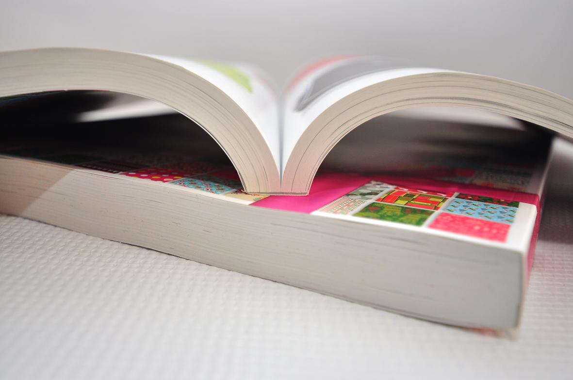
Perfect binding is often used, and gives a result similar to paperback books. National Geographic is one example of this type. Paperback or soft cover books are also normally bound using perfect binding. They usually consist of various sections with a cover made from heavier paper, glued together at the spine with a strong glue. The sections are milled in the back and notches are applied into the spine to allow hot glue to penetrate into the spine of the book. The other three sides are then face trimmed. This is what allows the magazine or paperback book to be opened. Mass market paperbacks (pulp paperbacks) are small (16mo size), cheaply made with each sheet fully cut and glued at the spine; these are likely to fall apart or lose sheets after much handling or several years. Trade paperbacks are more sturdily made, with traditional gatherings or sections of bifolios, usually larger, and more expensive. The difference between the two can usually easily be seen by looking for the sections in the top or bottom sides of the book.


Case binding is the most common type of hardcover binding for books. The pages are arranged in signatures and glued together into a "textblock." The textblock is then attached to the cover or "case" which is made of cardboard covered with paper, cloth, vinyl or leather. This is also known as perfect binding, cloth binding, or edition binding.

OUGD501: Context of Practice: Applying the Shannon & Weaver's model

Apply Shannon & Weaver's model to an example of communication. ow widely is the applicable? How useful do you find this source of exercise. Write a short analysis for your blogs, also think about the limits of Shannon & Weaver's model

What are the main communicative functions of redundancy? what do we mean by saying the English language is 50% redundant?

Discuss the ways in which convention can be said to facilitate understanding. Think of visual communication that breaks or extend specific conventions. How does this affect desire to communicate or the audience the reach? 

The Model

I have chosen to apply the Shannon & Weaver's model to the series of adverts which Apple use to promote their products. Apple have always had a high level of sophistication within their adverts, very incising  simple. Incredibly informative, I feel this would be an interesting subject to investigate, and apply the model to. 

Apple uses the the specifications of the product (the information source) The specifications are extremely minimal Apple then uses their advertising team, the world renown designer Sir. Jony to create a short video (the encoder) which becomes the advert, the deliverable (the channel), they advert is then received by the audience, (the decoder) either from the adverts on television, YouTube and other websites or on Apple's website itself. The audience then take in the information and make sense of it, (the destination)


The adverts have a much different approach, rather than applying the products to a situation, much like competing technology companies, for example, Samsung who show the target audience enjoying the product, seen below, whereas Apple's initial product reveal ads usually show Sir Jony I've discussing the technical aspects of the product, with complementary shots of the product, showcasing it in an almost human like fashion. 


Redundancy within

Apple's adverts could be described as extremely redundant. Redundancy is the lack of information, in a sense that there is not a huge amount to take in, or to understand, a smoother method of communication. The adverts use precise phrases such as "The iPhone 5 is the thinnest, lightest phone". An example of redundancy within the Apple ads, they always use simple, short phrases using words to describe a change or an exact percentage, for example "14% lighter". Apple uses the the specifications of the product (the information source) The specifications are extremely minimal Apple then uses their advertising team, the world renown designer Sir. Jony to create a short video (the encoder) which becomes the advert, the deliverable (the channel), they advert is then received by the audience, (the decoder) either from the adverts on television, YouTube and other websites or on Apple's website itself. The audience then take in the information and make sense of it, (the destination), perhaps comparing the specs given to their current phone, contemplating an upgrade, depending on the impact of  the advert, which in itself is extremely redundant, which eliminates the possibility of any confusion being created, (noise) a simple message.  

The English Language is 50% Redundant!

The phrase 'English is 50% redundant' is referring to the obtuse way in which we have several words which have the same meaning, equivalent duplicates. Words and phrases such as 'We ascended upwards' or 'the end result'. 


OUGD504: STUDIO BRIEF 1 - Design for Print // Layout Design Research

As part of my publication, I want to research into layout design, so I can present the information within my print manual, as well as I possibly can.


This piece uses layout in a very interesting fashion. Leaving a large amount of white or in this case, black space. It appears to use a rule of thirds throughout. What they don't do, is obey a rule with readability. Typically, you would allow room for 7-10 words per-line, and nothing more. Purely as the eye begins to trail off after 7 words. This publication uses type and readability in the same way a novel would, almost. Also allowing full pages for large impactful imagery. http://www.workinprogress.no/ 


This is another example of editorial design. It uses white space, and a horizontal central gutter to separate two columns of text. Justified in a way to make it almost look centre aligned. They have pages dedicated to images, rather than using the full page for the image, instead they have a large amount of space around it.  http://pepper-cinnamon.net/


The layout design featured in this publication has an overlapping grid. The lines of text extend onto the next page. As they do with the images, it's quite unusual, but it works. I wouldn't do this type of layout on a normal page, however on a double page spread, where the two leaves are of the same paper, I'm sure this would be more than acceptable. http://www.kasperpyndt.dk/


This publication uses a few full page images, or in this examples, more specifically, and example of calligraphy.  http://www.wanderandfind.com/


These publications use full page spreads, with a small amount of information at the bottom, the absolute minimum needed. Also using an overprinting colour technique, on top of the images throughout the publication. http://studionewwork.com/


A slightly more plain layout design, using grids to create a central aligned, fully justified type, leaves a very aesthetically please look about it. That will full images covering whole pages, it does work rather well, and looks extremely balanced. http://www.relajaelcoco.com/

OUGD504: STUDIO BRIEF 1 - WHAT IS DESIGN FOR PRINT? // Colour Systems

Contrasts

Contrast of Tone
  • Formed by the juxtaposition of light and dark values. This could be monochromatic. 
  • The Rods in your eyes differentiate tone. 
  • Monochromatic is the tone of one colour, not just greyscale. 
  • In greyscale, the primary colours are the lightest, the darkest and the mid tone, when the colour wheel is desaturated.
  • Tonal Spectrum, white round to black.
  • White and Black on 50% are equally legible, even though the contrasts are extreme, as they're both the same distance from 50%.
  • The same principle can be applied to colour. (Example, Red on Orange)
Contrast of Hue
  • Formed by the juxtaposing of different hues. The greater the distance between hues on a colour wheel, the greater the contrast. 
  • On a white background, blue would stand out the most, as, seen in tone, it's got the darkest value. 
  • On a black background, yellow stands out the most, as it has the lightest tonal value. Red almost blends in, as it's the mid tone. 
  • Use black and white very carefully in Graphic Design, as it cancels out colours.
  • High contrast colours, RYB, when placed together all fight for attention.
  • The contrast of hue and tone are having an impact on our ability to read words.
Contrast of Saturation
  • Formed by the juxtaposition of light and dark values and heir relative saturation.
  • Grey background with blue on, we would say the blue shape is blue.
  • However, when we add a more saturated blue, the original blue shape looks let saturated, and not really 'blue'.
  • This process can be repeated, contrasting more and more, until we get the primary blue, absolute blue, and the rest become very desaturated, looks paler, greyer, duller. etc.
  • The same process can be applied to other colours, and tints. (for example, adding white)
  • Contrast of Hue, Tone and Saturation, all work in this sense.
Contrast of Extension
  • Former by assigning proportional field sizes in relation to the visual weight of a colour. Also known as the proportion. 
  • Assigning different subjective values to colours, certain colours have certain weights.
  • Blue would appear the heaviest, as it's the darkest, Yellow would appear the lightest, as it's the lightest, and Red would be the mid tone. 
  • We have have less Violet, and more Yellow to have a visual balance. 
  • In relation to this, we can have less Yellow and more Violet, and we see a stand-out balance.
  • If we talk about imbalance, one of this colours is going to jump out. (see slides)
  • Using stripes of violet creates an imbalance, and it's easier to look at a block of violet. 
  • However, then these stripes are spaces out across a bigger area of yellow, your field of view increases, and it become almost easier to look at.It affects our ability to see those colours accurately. 
  • Hierarchy - spacial quality also applies, as it would with type.
  • High contrast colours, always, jump out at you. 
  • Small amounts of colour, with large amounts of colour work better. Don't use the same amount of colour. 
Contrast of Temperature
  • Formed by juxtaposing hues that can be considered "warm" or 'cool'. 
  • The warmest colour would be something which sits in the red-orange area
  • The coolest would be in the blue-green area.
  • In-between we have colour which movie from the warm to the cool, and vice-versa, on both sides. 
  • Taking a mid red and pushing it towards violet, you're making it cooler. 
  • However, this makes the red look more orange, making it look warmer.
  • If you add a more orange red, it makes the original red look cooler, and the violet look even cooler.
  • However in contrast this makes the orange look warmer. 
  • The middle section, which is a flat colour, appears to look like a gradient (see slide)
  • If you place colours of the decreasing temperature, next to each other in a gradual pattern, it looks like a gradient. 
  • We can see the (above) colours are separate colours, with black bars in-between them, but when the black is taken away, it's a gradient. 
Complementary Contrast
  • Formed by the juxtaposition complementary colour from a colour wheel of perceptual opposites. 
  • Red and Green are complete opposites on the colour wheel, and putting those two colours together looks almost painful.
  • De-saturating the blue and the orange in this image, and it becomes a complementary contrast, these two colours are fighting of attention.
  • Yellow and Blue and equidistant from the green so when Yellow and Blue stiles are applied, they look better. However, Blue has a similar tone to Green than Yellow, so it's easier to look at.
  • If you invert the background, the blue becomes difficult to look at, the the Red becomes calm, it's not fighting for your attention. 
Simultaneous Contrast
  • Formed by the boundaries of colours which perceptually vibrate. 
  • Bright Yellow, with Bright Green on top of it.The longer you stare at it, the yellow begins to turn slightly more orange.
  • When you put certain colours next to each other, they start to vibrate.
  • Putting Yellow on grey, there's a hint of violet, then with blue and grey, there's a hint of orange. 
 Taken from my Design Principles post from Level 4.  

Colour Systems 

Designers have a selection of colour systems and frameworks to work wot. The selection of a particular colour system will often depend upon how the final design is to be produced and/or presented, as different systems possess different limitations and options. It is important to recognise and understand that a final design needs to incorporate the appropriate colour system for its intended use. 

Two of the most widely recognised and commonly used colour systems are RGB (red, green and blue) and CMYK (cyan, magenta, yellow and black). RGB is typically used for digitial publishing and initial designs, and CMYK is used for print publishing. An awareness of the limits of different colour systems allows the designer to produce work safe in the knowledge that it will be reproduced accurately and as intended. 

Additionally, the six-colour Hexachrome colour system has two more colours: orange and green. This produces a larger gamut of colours than the basic four-colour CMYK printing process. 

Special process colours can also be used to provide precise colour control and intense graphic effects, for example, through the use of fluorescent and metallic colours. Special colours may be applied via a separate printing plate or by replacing one of the standard process colours. While ensuring accuracy of a given colour, the incorporation of special colour changes the overall gamut of colours that can be produced. 

(Taken from p29 Ambrose / Harris: Design Basics Colour)


Copyright 2010. All rights reserved.

RSS Feed. This blog is proudly powered by Blogger and uses Modern Clix, a theme by Rodrigo Galindez. Modern Clix blogger template by Introblogger.