Showing posts with label Design For Print. Show all posts

OUGD504: STUDIO BRIEF 1 - Design for Print // Chronologies Print

“I love a ballad in print alive, for then we are sure they are true.” Shakespeare. 
  • If it is print then is seen to be true. 
  • It is correct, it is factual. 
  • Other sources can be altered, for example Chinese whispers, whereas print cannot be altered, it is fact.
  • Documentation. Communication. Reproduction.
  • It is correct, it is factual. 
Early Print Making
  • 200 AD - Woodcut Printing in China.
  • 650 AD, buddhist script, religious text. 
Mass Communication
  • The first moveable type was in Asia, around 1000 AD.
  • Guttenberg Press - innovative technology
  • Communities were growing, communication was growing 
  • Changing society 
  • Religious beliefs and politics forming society, - as they new how to read and write
  • Cultural awareness about themselves - trickle down effect
European Output of Printed Books ca. 1450-1800
  • Communication changed, the number of printed books went from nothing to 200,000,000 in a century.
  • Becoming rules in countries with a formalised religion. 
  • In 1500, all of Europe and the Uk could print. 
  • Changed the world from a verbal culture to a visual culture
  • You had master craftsmen working with hot type, lead presses. Which is where glyphs started, purely through laziness. To simplify the print process, punctuation also formed. 
The Medium is the Message, Marshall McLuhan, 1911-1980
  • He predicted the world wide web 30 years before it was conceived
  • New technologies like the printing press, he understood how it would change social interaction.
  • Individualism, Democracy, Capitalism, Nationalism - pivotal to society, and print really pushed these.
Lino Type
  • Revolutionised the print world. 
  • Late 1800s, Used within print publication as it could be changed. 
  • Keyboards begun to be used, powered by electricity - 
  • The New York Press used these presses on an industrial scale.
  • When this died, many people were out of jobs. As it was a particular skill people learnt.
Etching
  • Ultimately fuelled by religious themes
  • Mass Communication
  • Print encapsulated everything, 
  • Lithography
  • Moulin Rouge print, using the traditional methods
  • Often reproduced
William Morris
  • Time of excess, interacted decorative designs used. Almost Asian influenced, using some bright colours, with over the top design. 
  • It was about making it look super fantastic, 
Propoganda, 1870
  • Colours coming through quite differently, almost like it had been painted,
  • Advertising which was cheap and put everywhere, 
  • Modernism
  • Clear image, clean crisp colours, solid imagery
  • If it’s print then it’s true
  • It’s correct, it’s factual 
  • Depicting war as a ‘hip’ event, whereas in reality, it wasn’t. 
  • Nazi Nationalism, using print to mass communication the message
The Daily Star
  • Why print is dangerous
  • They planned to stand up and fight for ‘british war heroes’ 
Andre The Giant
  • Turned into the OBEY image, using an image of Andre to base off, which turned into a brand
  • Connected to the youth, and then created the HOPE Obama image
  • Amber has the hots for Hulk Hogan. 

OUGD504: STUDIO BRIEF 1 - Design for Print // Screen Printing in Books

I'd like to screen printing in some part of my book, wether it be on the cover, or the inners. I've found some examples of screen printing applied to books. One of wonderful things about screen printing, is that it adds a certain texture to the books. Some depth, as opposed to digital printing. 


The example above, it a screen printed book cover, for 87 Octane. The white ink can be applied to white when screen printing, and with multiple passes, you can almost make the white look solid. As opposed to the print on the right. Something which cannot be recreated with digital print. 


Above is the fully screen printed book, for Craig Oldham's democratic lecture, which I myself own a copy of. The whole publication has a wonderful texture, you can feel the type, throughout. It's printed on mount board, that with the textured text, really has a solid feel. 


These two books, which I assume are part of a range, due to the likeness, are two colour on stock prints. Using a base colour, the solid yellow or blue, with the back printed over the top. Their 'artistic' style allows the prints to not exactly be aligned and still achieve the desired effect. 


OUGD504: STUDIO BRIEF 1 - Design for Print // Limited Colour Usage in Editorial Design


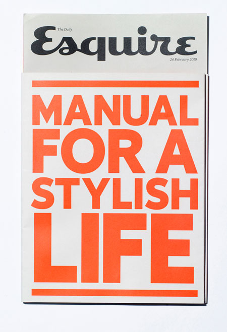
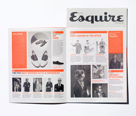
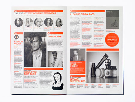
This publication uses black and white throughout, with an almost signature orange, as a highlight, throughout. The contrast works extremely well, it adds some definition and some style to the publication, ridding it of a plainer, more boring method of reading information.


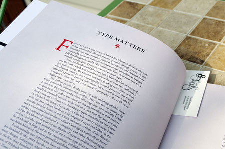
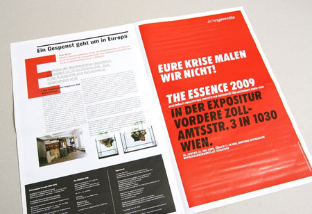
This example uses red as a logo, in the top of the page, and on the larger F at the start of the first paragraph, whilst using plain black body copy on white stock. The red pops in contrast to the plain looking page. 


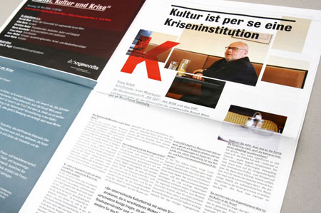
This publication uses red. It's used as a background for one of the leaves, and as an overprint colour for a letterform when titling a page. See the K, for example, on the second image. It overprints and image. 


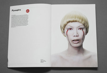
This example uses colour sampling, or even photo-manipulation, to create a constant red which is used throughout the publication. So there is a tie-in between the copy and the image, a form of constancy, throughout the magazine. 


OUGD504: STUDIO BRIEF 1 - WHAT IS DESIGN FOR PRINT? // Info-Pack Initial Research

Before I begin to design some concepts for my info pack, I want to get a good range of variations, from which I can use to generate some ideas. In this post, I'll be looking at some info packs, and also some creative packaging - something to deliver the info pack in.

Below is an info-pack from another student, level 6 currently (2013/14) I believe.


OUGD504: STUDIO BRIEF 1 - WHAT IS DESIGN FOR PRINT? // Commercial Costing

When defining the cost for commercial printing you must take into consideration a few several factors. I looked at a printers website, to see how their costing is spread out, how it works. Of course, getting actual figures would be useless, as each individual printers will have different rates.

Size
The first factor which you must consider is the size of the stock, in relation to the amount of ink applied. For example, if you were to print on 45 leaves within an A5 publication single sided it would be [x], however, if you were to print double sided within the document, you may pay double [2x]. You might also want to double the size of the document, making each of the leave A4, as apposed to A5, resulting you to pay [4x].

Quantity
If you’re not 100% sure, please let us know the minimum / maximum you’re likely to need as it will be fine to estimate within these parameters. For anything “litho” printed a large element of the overall cost can be the set up, the “run-on” figure for increased volumes is usually a pleasant surprise.

Material
With such a wide range available, we are happy to offer advice based on similar completed projects and specific recommendations on viewing the planned artwork. Our default materials are premium grade triple coated silk/matt/gloss FSC certified with minimum 15% recycled content, or FSC uncoated (option of 100% recycled). Please note you/we can include the relevant FSC environmental logo & supporting text on any project that uses FSC certified stock (in reality, nearly all) – there’s absolutely no cost implication for you …

Printing
If we are to print in 4 colour process (full colour), defined spot/pantone/metallic colours or a combination of the two – we will generally include a machine seal on all silk/matt coated stocks and also a special seal for uncoated stocks with large ink coverage requirements. This will not affect the printing or final appearance, but will prevent rubbing/marking.

Finishing
Some jobs are very straightforward, others involve several finishing elements – we can also show certain finishing options (e.g. lamination, spot UV varnishing) as an additional cost, for you to work out what fits within the overall project budget, where applicable.

Time Frame
We pride ourselves on never missing an agreed deadline (and we’ll be honest – if on the rare occasion it’s impossible to complete a requested time we’ll tell you at the outset, not mid-project). We operate 6.00am-midnight print shifts on presses and so with a bit of advance warning we can make most things happen. But advance warning is the key – even if final artwork is not ready we can reserve a repro & press slot working back from your deadline and also organise the materials if size/quantity is known. As all proofing/printing is completed under the one roof we are in complete control of the project … and therefore the deadline.

http://www.printhouse.co.uk/2011/01/quick-accurate-estimates/

OUGD504: STUDIO BRIEF 1 - Design for Print // Book Binding Research


Coptic binding or Coptic sewing comprises methods of bookbinding employed by early Christians in Egypt, the Copts, and used from as early as the 2nd century AD to the 11th century. The term is also used to describe modern bindings sewn in the same style.

Coptic bindings, the first true codices, are characterized by one or more sections of parchment, papyrus, or paper sewn through their folds, and (if more than one section) attached to each other with chain stitch linkings across the spine, rather than to the thongs or cords running across the spine that characterise European bindings from the 8th century onwards. In practice, the phrase "Coptic binding" usually refers to multi-section bindings, while single-section Coptic codices are often referred to as "Nag Hammadi bindings," after the 13 codices found in 1945 which exemplify the form.


A saddle stitch is appropriate for small booklets and, in general, for volumes with only a few pages. Most magazines that are not glued are saddle stitched: that is, they are held together by staples that run through the gutter. Once the pages are aligned and in the right order, this type of binding is quite straightforward. Staplers with extremely long jaws, designed specifically for saddle stitching, are available in office supply stores. Some photocopiers produce saddle-stitched volumes automatically.


Perfect binding is often used, and gives a result similar to paperback books. National Geographic is one example of this type. Paperback or soft cover books are also normally bound using perfect binding. They usually consist of various sections with a cover made from heavier paper, glued together at the spine with a strong glue. The sections are milled in the back and notches are applied into the spine to allow hot glue to penetrate into the spine of the book. The other three sides are then face trimmed. This is what allows the magazine or paperback book to be opened. Mass market paperbacks (pulp paperbacks) are small (16mo size), cheaply made with each sheet fully cut and glued at the spine; these are likely to fall apart or lose sheets after much handling or several years. Trade paperbacks are more sturdily made, with traditional gatherings or sections of bifolios, usually larger, and more expensive. The difference between the two can usually easily be seen by looking for the sections in the top or bottom sides of the book.


Case binding is the most common type of hardcover binding for books. The pages are arranged in signatures and glued together into a "textblock." The textblock is then attached to the cover or "case" which is made of cardboard covered with paper, cloth, vinyl or leather. This is also known as perfect binding, cloth binding, or edition binding.

OUGD504: STUDIO BRIEF 1 - Design for Print // Layout Design Research

As part of my publication, I want to research into layout design, so I can present the information within my print manual, as well as I possibly can.


This piece uses layout in a very interesting fashion. Leaving a large amount of white or in this case, black space. It appears to use a rule of thirds throughout. What they don't do, is obey a rule with readability. Typically, you would allow room for 7-10 words per-line, and nothing more. Purely as the eye begins to trail off after 7 words. This publication uses type and readability in the same way a novel would, almost. Also allowing full pages for large impactful imagery. http://www.workinprogress.no/ 


This is another example of editorial design. It uses white space, and a horizontal central gutter to separate two columns of text. Justified in a way to make it almost look centre aligned. They have pages dedicated to images, rather than using the full page for the image, instead they have a large amount of space around it.  http://pepper-cinnamon.net/


The layout design featured in this publication has an overlapping grid. The lines of text extend onto the next page. As they do with the images, it's quite unusual, but it works. I wouldn't do this type of layout on a normal page, however on a double page spread, where the two leaves are of the same paper, I'm sure this would be more than acceptable. http://www.kasperpyndt.dk/


This publication uses a few full page images, or in this examples, more specifically, and example of calligraphy.  http://www.wanderandfind.com/


These publications use full page spreads, with a small amount of information at the bottom, the absolute minimum needed. Also using an overprinting colour technique, on top of the images throughout the publication. http://studionewwork.com/


A slightly more plain layout design, using grids to create a central aligned, fully justified type, leaves a very aesthetically please look about it. That will full images covering whole pages, it does work rather well, and looks extremely balanced. http://www.relajaelcoco.com/

OUGD504: STUDIO BRIEF 1 - WHAT IS DESIGN FOR PRINT? // Colour Systems

Contrasts

Contrast of Tone
  • Formed by the juxtaposition of light and dark values. This could be monochromatic. 
  • The Rods in your eyes differentiate tone. 
  • Monochromatic is the tone of one colour, not just greyscale. 
  • In greyscale, the primary colours are the lightest, the darkest and the mid tone, when the colour wheel is desaturated.
  • Tonal Spectrum, white round to black.
  • White and Black on 50% are equally legible, even though the contrasts are extreme, as they're both the same distance from 50%.
  • The same principle can be applied to colour. (Example, Red on Orange)
Contrast of Hue
  • Formed by the juxtaposing of different hues. The greater the distance between hues on a colour wheel, the greater the contrast. 
  • On a white background, blue would stand out the most, as, seen in tone, it's got the darkest value. 
  • On a black background, yellow stands out the most, as it has the lightest tonal value. Red almost blends in, as it's the mid tone. 
  • Use black and white very carefully in Graphic Design, as it cancels out colours.
  • High contrast colours, RYB, when placed together all fight for attention.
  • The contrast of hue and tone are having an impact on our ability to read words.
Contrast of Saturation
  • Formed by the juxtaposition of light and dark values and heir relative saturation.
  • Grey background with blue on, we would say the blue shape is blue.
  • However, when we add a more saturated blue, the original blue shape looks let saturated, and not really 'blue'.
  • This process can be repeated, contrasting more and more, until we get the primary blue, absolute blue, and the rest become very desaturated, looks paler, greyer, duller. etc.
  • The same process can be applied to other colours, and tints. (for example, adding white)
  • Contrast of Hue, Tone and Saturation, all work in this sense.
Contrast of Extension
  • Former by assigning proportional field sizes in relation to the visual weight of a colour. Also known as the proportion. 
  • Assigning different subjective values to colours, certain colours have certain weights.
  • Blue would appear the heaviest, as it's the darkest, Yellow would appear the lightest, as it's the lightest, and Red would be the mid tone. 
  • We have have less Violet, and more Yellow to have a visual balance. 
  • In relation to this, we can have less Yellow and more Violet, and we see a stand-out balance.
  • If we talk about imbalance, one of this colours is going to jump out. (see slides)
  • Using stripes of violet creates an imbalance, and it's easier to look at a block of violet. 
  • However, then these stripes are spaces out across a bigger area of yellow, your field of view increases, and it become almost easier to look at.It affects our ability to see those colours accurately. 
  • Hierarchy - spacial quality also applies, as it would with type.
  • High contrast colours, always, jump out at you. 
  • Small amounts of colour, with large amounts of colour work better. Don't use the same amount of colour. 
Contrast of Temperature
  • Formed by juxtaposing hues that can be considered "warm" or 'cool'. 
  • The warmest colour would be something which sits in the red-orange area
  • The coolest would be in the blue-green area.
  • In-between we have colour which movie from the warm to the cool, and vice-versa, on both sides. 
  • Taking a mid red and pushing it towards violet, you're making it cooler. 
  • However, this makes the red look more orange, making it look warmer.
  • If you add a more orange red, it makes the original red look cooler, and the violet look even cooler.
  • However in contrast this makes the orange look warmer. 
  • The middle section, which is a flat colour, appears to look like a gradient (see slide)
  • If you place colours of the decreasing temperature, next to each other in a gradual pattern, it looks like a gradient. 
  • We can see the (above) colours are separate colours, with black bars in-between them, but when the black is taken away, it's a gradient. 
Complementary Contrast
  • Formed by the juxtaposition complementary colour from a colour wheel of perceptual opposites. 
  • Red and Green are complete opposites on the colour wheel, and putting those two colours together looks almost painful.
  • De-saturating the blue and the orange in this image, and it becomes a complementary contrast, these two colours are fighting of attention.
  • Yellow and Blue and equidistant from the green so when Yellow and Blue stiles are applied, they look better. However, Blue has a similar tone to Green than Yellow, so it's easier to look at.
  • If you invert the background, the blue becomes difficult to look at, the the Red becomes calm, it's not fighting for your attention. 
Simultaneous Contrast
  • Formed by the boundaries of colours which perceptually vibrate. 
  • Bright Yellow, with Bright Green on top of it.The longer you stare at it, the yellow begins to turn slightly more orange.
  • When you put certain colours next to each other, they start to vibrate.
  • Putting Yellow on grey, there's a hint of violet, then with blue and grey, there's a hint of orange. 
 Taken from my Design Principles post from Level 4.  

Colour Systems 

Designers have a selection of colour systems and frameworks to work wot. The selection of a particular colour system will often depend upon how the final design is to be produced and/or presented, as different systems possess different limitations and options. It is important to recognise and understand that a final design needs to incorporate the appropriate colour system for its intended use. 

Two of the most widely recognised and commonly used colour systems are RGB (red, green and blue) and CMYK (cyan, magenta, yellow and black). RGB is typically used for digitial publishing and initial designs, and CMYK is used for print publishing. An awareness of the limits of different colour systems allows the designer to produce work safe in the knowledge that it will be reproduced accurately and as intended. 

Additionally, the six-colour Hexachrome colour system has two more colours: orange and green. This produces a larger gamut of colours than the basic four-colour CMYK printing process. 

Special process colours can also be used to provide precise colour control and intense graphic effects, for example, through the use of fluorescent and metallic colours. Special colours may be applied via a separate printing plate or by replacing one of the standard process colours. While ensuring accuracy of a given colour, the incorporation of special colour changes the overall gamut of colours that can be produced. 

(Taken from p29 Ambrose / Harris: Design Basics Colour)


OUGD504: STUDIO BRIEF 1 - Design For Print // Stock Consideration Research

Stock Considerations

Paper Weight/Density:


Paper density (also known as basis weight and grammage) is a term used in the pulp and paper industry and also for fabric industry to denote a measure of mass of the product per unit of area for a type of fabric, paper or paperboard. 

The term "density" is not used in its traditional sense of mass per unit volume. "Paper density", rather, is a measure of the area density. Paper products that let little or no light pass through (e.g. poster board) are considered dense or heavy. Paper products that allow some light to pass through (e.g. tissue paper) are considered lightweight. In the pulp and paper industry, it is common to set a commercial paper machine to produce paper to a target paper density. Paper density can also be used to distinguish paper from paperboard as the latter usually has a grammage greater than 134 g/m².
Two ways of expressing grammage are commonly used: 
Expressed in grams per square meter (g/m²), paper density is also known as grammage. This is the measure used in most parts of the world.
Expressed in terms of the mass (expressed as weight) per number of sheets, it is known as basis weight. The convention used in the United States and a few other countries using US paper sizes is pounds of a ream of 500 (or in some cases 1000) sheets of a given (raw, still uncut) basis size. Japanese paper is expressed as the weight in kg of 1000 sheets.


Grammage

In the metric system, the mass per unit area of all types of paper and paperboard is expressed in terms of grams per square meter (g/m²). This quantity is commonly called grammage in both English and French (ISO 536), though printers in most English-speaking countries still refer to the "weight" of paper.Typical office paper has 80 g/m², therefore a typical A4 sheet (1⁄16 m²) weighs 5 g.
The unofficial unit symbol "gsm" instead of the standard "g/m²" is also widely encountered in English speaking countries.
Typically grammage is measured in paper mill on-line by Quality Control System (QCS) and verified by laboratory measurement.

Basis Weight

In countries that use United States paper sizes, a less direct measure known as basis weight is used in addition to or instead of grammage. The basis weight of paper is the density of paper expressed in terms of the mass of a ream of given dimensions and a sheet count. In the US system, the weight is specified in avoirdupois pounds and the sheet count of a paper ream is usually 500 sheets. However, the mass specified is not the mass of the ream that is sold to the customer. Instead, it is the mass of the uncut "basis ream" in which the sheets have some larger size. Often, this is a size used during the manufacturing process before the paper was cut to the dimensions in which it is sold. So, to compute the mass per area, one must know 
the mass of the basis ream,
the number of sheets in that ream, and
the dimensions of an "uncut" sheet in that ream.
The standard dimensions and sheet count of a ream vary according to the type of paper. These "uncut" basis sizes are not normally labelled on the product, are not formally standardized, and therefore have to be guessed or inferred somehow from trading practice. Historically, this convention is the product of pragmatic considerations such as the size of a sheet mold.


By using the same basis sheet size for the same type of paper, consumers can easily compare papers of differing brands. Twenty pound bond paper is always lighter and thinner than 32 pound bond, no matter what its cut size. And 20 pound bond letter size and 20 pound bond legal sizepapers are the same weight paper having different cut size.

However, a sheet of common copy paper that has a basis weight of 20 pounds (9.1 kg) does not have the same mass as the same size sheet of coarse paper (newsprint). In the former case, the standard ream is 500 sheets of 17-by-22-inch (432 by 559 mm) paper, and in the latter, 500 sheets of 24-by-36-inch (610 by 914 mm) paper. Here are some basic ream sizes for various types of paper. Units are inches except where noted.
Paper Type - Paper Size - Number of Sheets
Bond, writing, ledger - 17 x 22 - 500 sheets
Manuscript cover - 18 x 31 - 500 sheets
Blotting - 19 x 24 - 500 sheetsBox Cover - 20 x 24 - 500 sheets
Cover - 20 x 26 - 500 or 1000 sheet
Bristol and tag - 22.5 x 28.5 - 500 sheets
Tissue - 24 x 36 - 480 sheets
Newsprint - 24 x 36 - 500 sheets
Hanging, waxing, bag, etc. - 24 x 36 - 500 sheets
Book, Text, Offset - 25 x 38 - 500 sheets
Index bristol - 25.5 x 30.5 - 500 sheets
Paperboard (all types) - 12 x 12 - 1000 sheets

Sheets 17 by 22 inches (432 by 559 mm) can be cut into four 8.5-by-11-inch (216 by 279 mm) sheets, a standard for business stationery known conventionally as letter sized paper. So, the 17-by-22-inch (432 by 559 mm) ream became commonly used. The 25-by-38-inch (635 by 965 mm) book-paper ream developed because such a size can easily be cut into sixteen 6 by 9-inch (229 mm) book-sized sheets without significant waste.

Early newsprint presses printed sheets 2 by 3 feet (0.610 by 0.914 m) in size, and so the ream dimensions for newsprint became 24 by 36 inches (610 by 914 mm), with 500 sheets to a ream. Newsprint was made from ground wood pulp, and ground wood hanging paper (wallpaper) was made on newsprint machines. Newsprint was used as wrapping paper, and the first paper bags were made from newsprint. The newsprint ream standard also became the standard for packaging papers, even though in packaging papers kraft pulp rather than ground wood was used for greater strength.
Paper weight is sometimes stated using the "#" symbol. For example, "20#" means "20 pounds per basis ream of 500 sheets".
When the density of a ream of paper is given in pounds, it is often accompanied by its "M weight". The M weight is the weight (in pounds) of 1000 cut sheets. Paper suppliers will often charge by M weight, since it is always consistent within a specific paper size, and because it allows a simple weight calculation for shipping charges.
For example, a 500-sheet ream of 20# 8.5-by-11-inch (216 by 279 mm) copy paper may be specified "10 M". 1000 cut sheets (or two reams) will weigh 10 lb (4.5 kg), half of the four reams of cut paper resulting from the 20# basis ream of 17-by-22-inch (432 by 559 mm) paper.


Caliper

Paper thickness, or caliper, is a common measurement specified and required for certain printing applications. Since a paper's density is typically not directly known or specified, the thickness of any sheet of paper cannot be calculated by any method. Instead, it is measured and specified separately as its caliper. However, paper thickness for most typical business papers might be similar across comparable brands. If thickness is not specified for a paper in question, it must be either measured or guessed based on a comparable paper's specification.
Caliper is usually measured in micrometres (1/1000 of a mm), or in the United States also in mils. (1 mil = 0.001 inch = 25.4 µm) In common measure "20-lb bond varies from about 0.0038 to 0.0045 in. thick." - From Wikipedia (I read it before copying it, I assure you)


OUGD504: STUDIO BRIEF 1 - Design for Print // STUDY TASK 1 - Print Processes

As part of this brief, I want to research into the following areas, to gain a greater understanding of them before I begin working on my info pack. They're also mandatory for the brief. Production Methods, Stock Considerations, Colour Systems and Commercial Costings. I plan to communicate these topics in my info pack, using some of the methods described below. 

Production Methods:

Below are some production methods I shall gain an understanding of during my print research, through practice. 


The method above is spot varnishing.


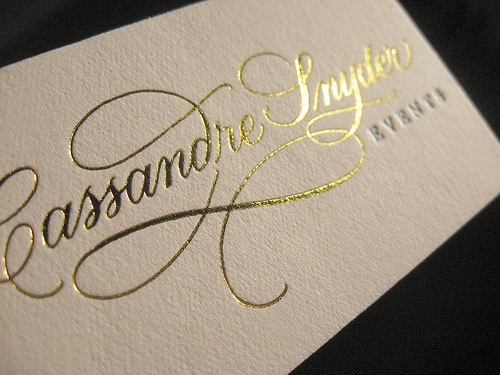
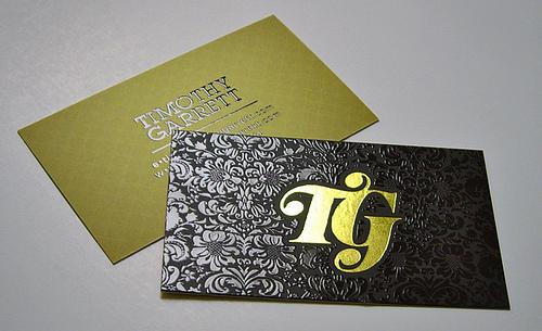
The method used above to create a gold shine on the text is called foiling.


Above is a method which is called embossing, which extrudes the content through the stock, adding a raised look, a texture, something very unique.


The method seen above is screen printing - you can print screens. 


Letterpress, typesetting, as seen above. The type is constructed, set and then printed. 


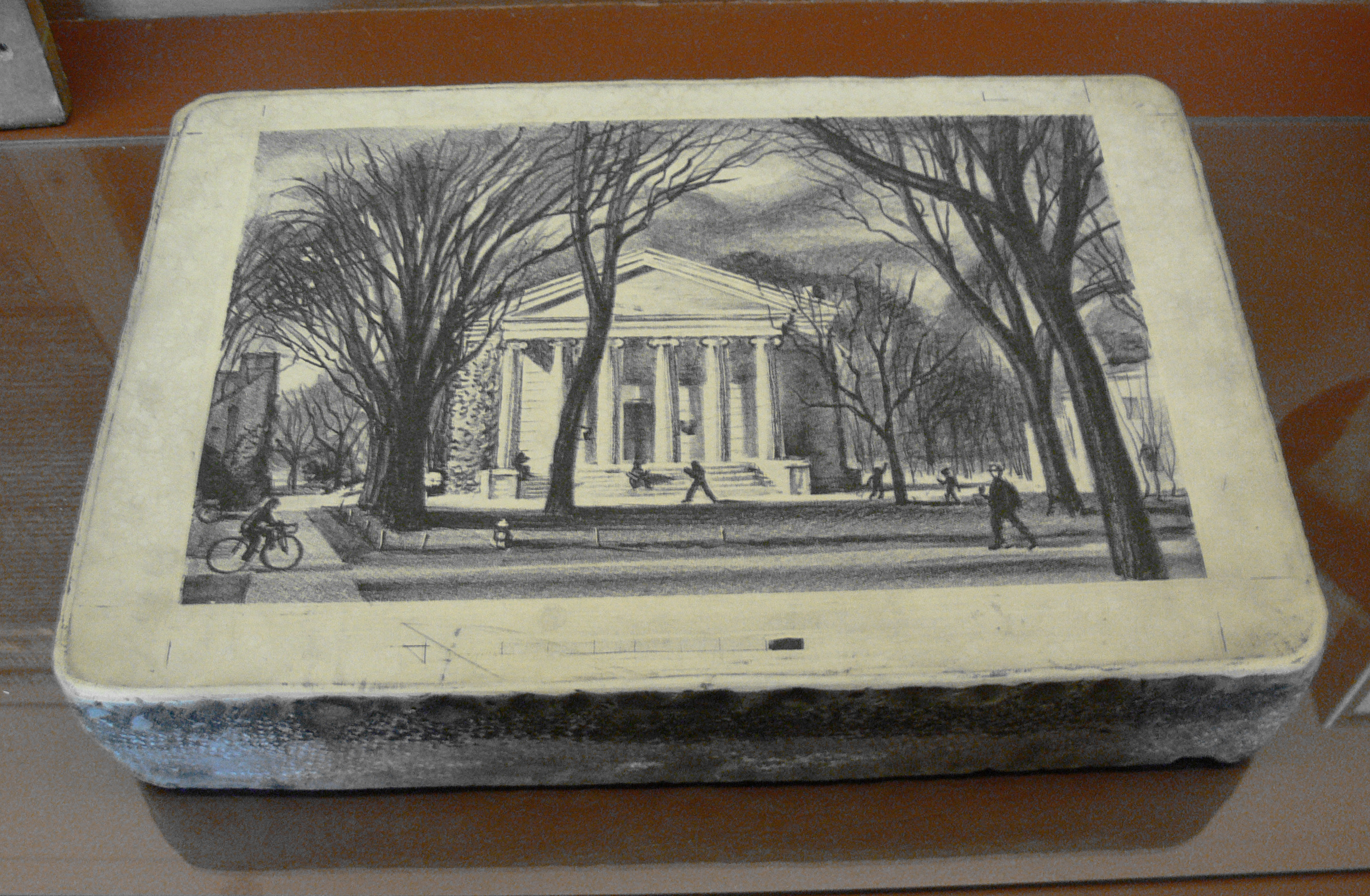
Lithography


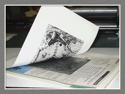
Lino cutting, a process where you remove parts of a sheet of lino to create an image, which is then printed. 


Mono-printing.


Etching.


UV Coating


Die cutting


Duplex Printing


Copyright 2010. All rights reserved.

RSS Feed. This blog is proudly powered by Blogger and uses Modern Clix, a theme by Rodrigo Galindez. Modern Clix blogger template by Introblogger.