OUGD504: STUDIO BRIEF 1 - Design for Print // Layout Design Research

As part of my publication, I want to research into layout design, so I can present the information within my print manual, as well as I possibly can.


This piece uses layout in a very interesting fashion. Leaving a large amount of white or in this case, black space. It appears to use a rule of thirds throughout. What they don't do, is obey a rule with readability. Typically, you would allow room for 7-10 words per-line, and nothing more. Purely as the eye begins to trail off after 7 words. This publication uses type and readability in the same way a novel would, almost. Also allowing full pages for large impactful imagery. http://www.workinprogress.no/ 


This is another example of editorial design. It uses white space, and a horizontal central gutter to separate two columns of text. Justified in a way to make it almost look centre aligned. They have pages dedicated to images, rather than using the full page for the image, instead they have a large amount of space around it.  http://pepper-cinnamon.net/


The layout design featured in this publication has an overlapping grid. The lines of text extend onto the next page. As they do with the images, it's quite unusual, but it works. I wouldn't do this type of layout on a normal page, however on a double page spread, where the two leaves are of the same paper, I'm sure this would be more than acceptable. http://www.kasperpyndt.dk/


This publication uses a few full page images, or in this examples, more specifically, and example of calligraphy.  http://www.wanderandfind.com/


These publications use full page spreads, with a small amount of information at the bottom, the absolute minimum needed. Also using an overprinting colour technique, on top of the images throughout the publication. http://studionewwork.com/


A slightly more plain layout design, using grids to create a central aligned, fully justified type, leaves a very aesthetically please look about it. That will full images covering whole pages, it does work rather well, and looks extremely balanced. http://www.relajaelcoco.com/

OUGD504: STUDIO BRIEF 1 - WHAT IS DESIGN FOR PRINT? // Colour Systems

Contrasts

Contrast of Tone
  • Formed by the juxtaposition of light and dark values. This could be monochromatic. 
  • The Rods in your eyes differentiate tone. 
  • Monochromatic is the tone of one colour, not just greyscale. 
  • In greyscale, the primary colours are the lightest, the darkest and the mid tone, when the colour wheel is desaturated.
  • Tonal Spectrum, white round to black.
  • White and Black on 50% are equally legible, even though the contrasts are extreme, as they're both the same distance from 50%.
  • The same principle can be applied to colour. (Example, Red on Orange)
Contrast of Hue
  • Formed by the juxtaposing of different hues. The greater the distance between hues on a colour wheel, the greater the contrast. 
  • On a white background, blue would stand out the most, as, seen in tone, it's got the darkest value. 
  • On a black background, yellow stands out the most, as it has the lightest tonal value. Red almost blends in, as it's the mid tone. 
  • Use black and white very carefully in Graphic Design, as it cancels out colours.
  • High contrast colours, RYB, when placed together all fight for attention.
  • The contrast of hue and tone are having an impact on our ability to read words.
Contrast of Saturation
  • Formed by the juxtaposition of light and dark values and heir relative saturation.
  • Grey background with blue on, we would say the blue shape is blue.
  • However, when we add a more saturated blue, the original blue shape looks let saturated, and not really 'blue'.
  • This process can be repeated, contrasting more and more, until we get the primary blue, absolute blue, and the rest become very desaturated, looks paler, greyer, duller. etc.
  • The same process can be applied to other colours, and tints. (for example, adding white)
  • Contrast of Hue, Tone and Saturation, all work in this sense.
Contrast of Extension
  • Former by assigning proportional field sizes in relation to the visual weight of a colour. Also known as the proportion. 
  • Assigning different subjective values to colours, certain colours have certain weights.
  • Blue would appear the heaviest, as it's the darkest, Yellow would appear the lightest, as it's the lightest, and Red would be the mid tone. 
  • We have have less Violet, and more Yellow to have a visual balance. 
  • In relation to this, we can have less Yellow and more Violet, and we see a stand-out balance.
  • If we talk about imbalance, one of this colours is going to jump out. (see slides)
  • Using stripes of violet creates an imbalance, and it's easier to look at a block of violet. 
  • However, then these stripes are spaces out across a bigger area of yellow, your field of view increases, and it become almost easier to look at.It affects our ability to see those colours accurately. 
  • Hierarchy - spacial quality also applies, as it would with type.
  • High contrast colours, always, jump out at you. 
  • Small amounts of colour, with large amounts of colour work better. Don't use the same amount of colour. 
Contrast of Temperature
  • Formed by juxtaposing hues that can be considered "warm" or 'cool'. 
  • The warmest colour would be something which sits in the red-orange area
  • The coolest would be in the blue-green area.
  • In-between we have colour which movie from the warm to the cool, and vice-versa, on both sides. 
  • Taking a mid red and pushing it towards violet, you're making it cooler. 
  • However, this makes the red look more orange, making it look warmer.
  • If you add a more orange red, it makes the original red look cooler, and the violet look even cooler.
  • However in contrast this makes the orange look warmer. 
  • The middle section, which is a flat colour, appears to look like a gradient (see slide)
  • If you place colours of the decreasing temperature, next to each other in a gradual pattern, it looks like a gradient. 
  • We can see the (above) colours are separate colours, with black bars in-between them, but when the black is taken away, it's a gradient. 
Complementary Contrast
  • Formed by the juxtaposition complementary colour from a colour wheel of perceptual opposites. 
  • Red and Green are complete opposites on the colour wheel, and putting those two colours together looks almost painful.
  • De-saturating the blue and the orange in this image, and it becomes a complementary contrast, these two colours are fighting of attention.
  • Yellow and Blue and equidistant from the green so when Yellow and Blue stiles are applied, they look better. However, Blue has a similar tone to Green than Yellow, so it's easier to look at.
  • If you invert the background, the blue becomes difficult to look at, the the Red becomes calm, it's not fighting for your attention. 
Simultaneous Contrast
  • Formed by the boundaries of colours which perceptually vibrate. 
  • Bright Yellow, with Bright Green on top of it.The longer you stare at it, the yellow begins to turn slightly more orange.
  • When you put certain colours next to each other, they start to vibrate.
  • Putting Yellow on grey, there's a hint of violet, then with blue and grey, there's a hint of orange. 
 Taken from my Design Principles post from Level 4.  

Colour Systems 

Designers have a selection of colour systems and frameworks to work wot. The selection of a particular colour system will often depend upon how the final design is to be produced and/or presented, as different systems possess different limitations and options. It is important to recognise and understand that a final design needs to incorporate the appropriate colour system for its intended use. 

Two of the most widely recognised and commonly used colour systems are RGB (red, green and blue) and CMYK (cyan, magenta, yellow and black). RGB is typically used for digitial publishing and initial designs, and CMYK is used for print publishing. An awareness of the limits of different colour systems allows the designer to produce work safe in the knowledge that it will be reproduced accurately and as intended. 

Additionally, the six-colour Hexachrome colour system has two more colours: orange and green. This produces a larger gamut of colours than the basic four-colour CMYK printing process. 

Special process colours can also be used to provide precise colour control and intense graphic effects, for example, through the use of fluorescent and metallic colours. Special colours may be applied via a separate printing plate or by replacing one of the standard process colours. While ensuring accuracy of a given colour, the incorporation of special colour changes the overall gamut of colours that can be produced. 

(Taken from p29 Ambrose / Harris: Design Basics Colour)


OUGD501: Context of Practice 2 (Lecture) - Consumerism

Consumerism: Persuasion, Society, Brand, Culture - Richard Miles 

W-F/17 - National Cash Register Building New York, World's fair 1939

Aims
  • Analyse the rise of SU Consumerism,
  • Discuss the links between consumerism and our conscious desires,
  • Sigmund Freud,
  • Edmund Bernays,
  • Consumerism as social control.
  • Century of Self - Adam Curtis  - 2002
  • No Logo (Brands Globalisation Resistance) - Naomi Klein - 1999

Sigmund Freud (1856-1939)
  • New theory of human nature,
  • Psychoanalysis,
  • Hidden primitive sexual forces and animal instincts which need controlling,
  • The interpretation of dream (1899)
  • The Unconscious (1915)
  • The Ego and the ID (1923)
  • Beyond the pleasure (1920)
  • Civilisation & it's discontents (1930
  • He analysed peoples dreams, talking about suppressed, dangerous animal instincts, people aren't rational beings, we're instinctual and desire based - irrational. 
  • Society stops us acting out on our fantasises.
  • Freud's Model of Personality Structure
  • Most of our actions are driven by what is beneath, the continuousness, the mind. In the 'ID'  - Pleasure principle - wish fulfilment. 
1930's
  • Fundamental tension between civilisation and the individual 
  • Human instincts incompatible with the well being of community
  • The pleasure principle. 
  • We all have the strong desire for violence or to have sex, but we can't act out on the desires - society imposes systems and laws to keep these at bay, in a harmonious world. Because of which, humanity will always be unhappy, those desires, must be released in some way. There are many ways repressed desires manifest themselves. 
  • If we are aloud to act out on these desires, in a socially acceptable way, one our desire has been satisfied, we are kind of docile and happy, not irrational, content. 
  • Fundentally, civilastional will make us discontent. 
WWI 1914-18
  • We should expect this from people, it shouldn't be a surprise the world is destroying itself, it's human instinct.
  • A morbid desire on a grand scale, 
  • Edward Bernays (1891 - 1995)
  • Press agent
  • Employed by public information during WW1,
  • Post war set up 'the council on Public relations'
  • Birth of PR (public relations)
  • Based on the idea of Freud (his uncle)
  • Crystallising Public opinion (1923)
  • Propaganda (1928) 
Torches of Freedom,
  • Any business can succeed if you relate the product to one of the repressed animal instincts, or any of the repressed unconscious instincts, you can make someone desire that product, through an unnecessary need. 
  • 1929 Easter Day Parade,
  • It was taboo for women to smoke, Bernays was employed by a tobacco company to get women to smoke. He payed a bunch of debutons to parade in New York, and at an organised moment, they all lit up cigarettes, and it was photographed, when it was photographed he fed a story that these women were a group of suffragettes, and this was a political protest about women in society, the cigarettes were dubbed torches of freedom, against the male repression of society.
  • Cigarettes had become a symbol of status, and app leaded as sexy. 
  • Attaching something meanness to a desire, for status, sex appeal and gratification  - a symbol of power.
1924
  • Product Placement,
  • Celebrity endorsements,
  • The use of pseudo-scientific reports,
  • This are bought because the illusion that those things will satisfy something subconsciously in some way,
  • America was investing in more factories and more technology, the need to mass produce things massively improved.
 Fordism
  • Henry Ford (1863 - 1947)
  • Transposed Taylorsim to car factories of Detroit,
  • Mass production, 
  • Moving assembly line,
  • Standart production models build as they move through the factory
  • Requires large investment, by increased productivity so much that reactively high wages can be paid, allowing the workers to by the product they produce. 
  • 1910 - 20,000 produces, $850
  • 1916 - 600,000
  • The emergence and the importance of brands. 
Aunt Jemima's Pancake Flour,
  • Originally became a product for pancake mix, 
  • However, house wives believed this robbed them of their jobs, 
  • so, they reduced it just flour, you need to add an egg to make the pancakes,
  • so house wives took this a believed they were cooking, 
  • Aiding that desire that there were actually cooking, providing. 
1909
  • Adverts and marketing strategies begin to rely on psychological needs,
  • Oldsmobile - aimed at men, showing power, you were in control. Of your car, your women, where you're going, 
  • the idea of a car being penis extension. 
  • Consciousness starts to shift from a society that needs to a society that desires. Wanting a car because you want to be powerful, rather than needing to travel.False needs, based on desire.

Marketing Hidden Needs
  • Selling emotional security
  • The Hidden Persuaders - Vance Packard,
  • Selling reassurance of worth,
  • Selling ego-gratification, 
  • Selling creative outlets
  • Selling love objects,
  • Selling a sense of power
  • Selling a sense of roots,
  • Selling immortality,
  • 'Blow in her face, and she will follow you anywhere' - cigarette ad (Tipalet).
1920
  • A new elite is needed to manage the bewildered herd,
  • Manufacturing consent,
  • People were sold on they could satisfy their desires on useless things, 
  • This on the back of a world war, so this is basically like anairky, 
  • If all the bewildered herd is satisfied, they society will work, 
Russian Revolution 1917,
  • They had a social revolution, 
  • A people's revolution, 
  • overthrew the rich and replaced it will a communist society, 
  • Putting PR into government policy,
  • October 24th, 1919 - Black Tuesday,
  • One of the biggest crashes in the stock market in the 20th century,
  • Which started the great depression, 
Roosevelt and the 'New Deal' (1933 - 36),
  • On the back of a promise to introduce welfare, society security
  • Creating jobs, and industry,
  • Rather than a scheme of big business doing what they want for society, 
  • this was about wealth creation, which was really unpopular for big businesses, 
  • World's Fair of 1940, in New York,
  • The Futurama,
  • Futuristic inventions which could be america's, 
  • new modes of travel, a depiction of what the world could be like. 
  • 'Democracity',
  • This would could be yours, at a cost, 
Conclusion
  • You are not what you own,
  • Consumerism is an ideological project,
  • We believe that through consumption our desires can be met
  • The Consumer self
  • The legacy of Bernays/PR can be felt in all aspects of C21st society, 
  • The conflicts between alternative models of social organisations continue to this day, 
  • To what extent are our lives free under the western consumerist system?


OUGD504: STUDIO BRIEF 1 - Design For Print // Stock Consideration Research

Stock Considerations

Paper Weight/Density:


Paper density (also known as basis weight and grammage) is a term used in the pulp and paper industry and also for fabric industry to denote a measure of mass of the product per unit of area for a type of fabric, paper or paperboard. 

The term "density" is not used in its traditional sense of mass per unit volume. "Paper density", rather, is a measure of the area density. Paper products that let little or no light pass through (e.g. poster board) are considered dense or heavy. Paper products that allow some light to pass through (e.g. tissue paper) are considered lightweight. In the pulp and paper industry, it is common to set a commercial paper machine to produce paper to a target paper density. Paper density can also be used to distinguish paper from paperboard as the latter usually has a grammage greater than 134 g/m².
Two ways of expressing grammage are commonly used: 
Expressed in grams per square meter (g/m²), paper density is also known as grammage. This is the measure used in most parts of the world.
Expressed in terms of the mass (expressed as weight) per number of sheets, it is known as basis weight. The convention used in the United States and a few other countries using US paper sizes is pounds of a ream of 500 (or in some cases 1000) sheets of a given (raw, still uncut) basis size. Japanese paper is expressed as the weight in kg of 1000 sheets.


Grammage

In the metric system, the mass per unit area of all types of paper and paperboard is expressed in terms of grams per square meter (g/m²). This quantity is commonly called grammage in both English and French (ISO 536), though printers in most English-speaking countries still refer to the "weight" of paper.Typical office paper has 80 g/m², therefore a typical A4 sheet (1⁄16 m²) weighs 5 g.
The unofficial unit symbol "gsm" instead of the standard "g/m²" is also widely encountered in English speaking countries.
Typically grammage is measured in paper mill on-line by Quality Control System (QCS) and verified by laboratory measurement.

Basis Weight

In countries that use United States paper sizes, a less direct measure known as basis weight is used in addition to or instead of grammage. The basis weight of paper is the density of paper expressed in terms of the mass of a ream of given dimensions and a sheet count. In the US system, the weight is specified in avoirdupois pounds and the sheet count of a paper ream is usually 500 sheets. However, the mass specified is not the mass of the ream that is sold to the customer. Instead, it is the mass of the uncut "basis ream" in which the sheets have some larger size. Often, this is a size used during the manufacturing process before the paper was cut to the dimensions in which it is sold. So, to compute the mass per area, one must know 
the mass of the basis ream,
the number of sheets in that ream, and
the dimensions of an "uncut" sheet in that ream.
The standard dimensions and sheet count of a ream vary according to the type of paper. These "uncut" basis sizes are not normally labelled on the product, are not formally standardized, and therefore have to be guessed or inferred somehow from trading practice. Historically, this convention is the product of pragmatic considerations such as the size of a sheet mold.


By using the same basis sheet size for the same type of paper, consumers can easily compare papers of differing brands. Twenty pound bond paper is always lighter and thinner than 32 pound bond, no matter what its cut size. And 20 pound bond letter size and 20 pound bond legal sizepapers are the same weight paper having different cut size.

However, a sheet of common copy paper that has a basis weight of 20 pounds (9.1 kg) does not have the same mass as the same size sheet of coarse paper (newsprint). In the former case, the standard ream is 500 sheets of 17-by-22-inch (432 by 559 mm) paper, and in the latter, 500 sheets of 24-by-36-inch (610 by 914 mm) paper. Here are some basic ream sizes for various types of paper. Units are inches except where noted.
Paper Type - Paper Size - Number of Sheets
Bond, writing, ledger - 17 x 22 - 500 sheets
Manuscript cover - 18 x 31 - 500 sheets
Blotting - 19 x 24 - 500 sheetsBox Cover - 20 x 24 - 500 sheets
Cover - 20 x 26 - 500 or 1000 sheet
Bristol and tag - 22.5 x 28.5 - 500 sheets
Tissue - 24 x 36 - 480 sheets
Newsprint - 24 x 36 - 500 sheets
Hanging, waxing, bag, etc. - 24 x 36 - 500 sheets
Book, Text, Offset - 25 x 38 - 500 sheets
Index bristol - 25.5 x 30.5 - 500 sheets
Paperboard (all types) - 12 x 12 - 1000 sheets

Sheets 17 by 22 inches (432 by 559 mm) can be cut into four 8.5-by-11-inch (216 by 279 mm) sheets, a standard for business stationery known conventionally as letter sized paper. So, the 17-by-22-inch (432 by 559 mm) ream became commonly used. The 25-by-38-inch (635 by 965 mm) book-paper ream developed because such a size can easily be cut into sixteen 6 by 9-inch (229 mm) book-sized sheets without significant waste.

Early newsprint presses printed sheets 2 by 3 feet (0.610 by 0.914 m) in size, and so the ream dimensions for newsprint became 24 by 36 inches (610 by 914 mm), with 500 sheets to a ream. Newsprint was made from ground wood pulp, and ground wood hanging paper (wallpaper) was made on newsprint machines. Newsprint was used as wrapping paper, and the first paper bags were made from newsprint. The newsprint ream standard also became the standard for packaging papers, even though in packaging papers kraft pulp rather than ground wood was used for greater strength.
Paper weight is sometimes stated using the "#" symbol. For example, "20#" means "20 pounds per basis ream of 500 sheets".
When the density of a ream of paper is given in pounds, it is often accompanied by its "M weight". The M weight is the weight (in pounds) of 1000 cut sheets. Paper suppliers will often charge by M weight, since it is always consistent within a specific paper size, and because it allows a simple weight calculation for shipping charges.
For example, a 500-sheet ream of 20# 8.5-by-11-inch (216 by 279 mm) copy paper may be specified "10 M". 1000 cut sheets (or two reams) will weigh 10 lb (4.5 kg), half of the four reams of cut paper resulting from the 20# basis ream of 17-by-22-inch (432 by 559 mm) paper.


Caliper

Paper thickness, or caliper, is a common measurement specified and required for certain printing applications. Since a paper's density is typically not directly known or specified, the thickness of any sheet of paper cannot be calculated by any method. Instead, it is measured and specified separately as its caliper. However, paper thickness for most typical business papers might be similar across comparable brands. If thickness is not specified for a paper in question, it must be either measured or guessed based on a comparable paper's specification.
Caliper is usually measured in micrometres (1/1000 of a mm), or in the United States also in mils. (1 mil = 0.001 inch = 25.4 µm) In common measure "20-lb bond varies from about 0.0038 to 0.0045 in. thick." - From Wikipedia (I read it before copying it, I assure you)


OUGD501: Context of Practice 2 (Seminar) - Communication Theory

The Shannon-Weaver mathematical model (1949)
  • Simplistic method of communication, 
  • Taking two elements and breaking them down into 5 element, plus the noise source. 
  • They primarily looked at telecommunications.
How this is relevant and applicable to Graphic Designers
  • Information Source: The concept, the idea, the brief, the problem. 
  • The Transmitter (encoder): creating the design, transforming the problem into a piece of Graphic Design
  • Channel: The Piece of Graphic Design itself, the deliverable
  • Receiver (Decoder): Someone making sense of the design, assuming it's good design 
  • Destination: The audience getting the message, the solution to the problem.
  • <s> Noise Source: Could be the stock, or to what it is applied to </s>
What problems could occur which would stop the communication; relevant to Graphic Design
  • Information Source: Information may be inaccurate, you might get the wrong end of the stick, conceptual problems, 
  • Transmitter (encoder): Limited timescale, creative block, bad designer, misinterpreted information, not considering the target audience 
  • Channel: Damaged or destroyed, ineffective location,  production issues, limitations of the subject
  • Receiver (Decoder): Perhaps it might be aimed at the wrong audience, Colour issues, could be offensive,
  • Destination: Lack of feedback, (however, this has hit a flaw with the model, as it's entirely linear, no way to give feedback), 
Methods to fix the problems
  • Information Source:Ask questions, make sure you know, do more research
  • Transmitter (encoder): Design it properly, get feedback
  • Channel: Make it simple, strong, understandable,
  • Receiver (Decoder): Make sure you're speaking in ways the understanding can understand
  • Destination: Give feedback.
Noises (things which disrupt the process)
  • Information Source: Low budget, budget limitations, boring subject, boring client - something which discourages you, unethical ideals
  • Transmitter (encoder): To the extent of your style, is it appropriate? Fussy clients, 
  • Channel: Destructions to the application, the z key doesn't work on the mac. 
  • Receiver (decoder): Colourblind clients, what's next to your design
  • Destination: poor reputation of the brand, lack of popular opinion, sub culture opinions. 
Communication Problems - Shannon-Weaver subcategorised all the possible problems which can go wrong
  • Level A - Technical Problems - How accurately can the message be transmitted
  • Level B - Semantic Problems - How precisely is the message conveyed
  • Level C - Effectiveness problems - How effectively does the received meaning affect behaviour 
Level A Problems 
  • Printing, 
  • cost, 
  • trail and error process, 
  • timescale, 
  • lack of understanding in relation to the process, 
  • lack of skill, 
  • Broken laptop, 
  • Problems with your ability to use software, 
  • Problems with your techniques
Level B  
  • Misinterpretation of the message both being conveyed and received
  • Tone of Voice
  • Colour schemes,
  • Visual stuff
Level C 
  • Offensive design, in poor taste,
  • Colour issues, 
  • Subtle metaphor, which may be misread
  • Location
Noise - Anything untended added to the single between transmission and reception. Noise can actually be something you aim for, something which you would want to communicate through. Not always entirely negative. Certain visually communicators might choose to be the noise source to an already established channel, for example putting graffiti onto a poster, to disrupt it, messing with the system. Hijacking an existing channel and making it your own, as a sort of visual pirate, creatively becoming the noise and inserting yourself into the channel, although you need to understand the channel before you place yourself into it. Noise can be both a problem and a solution. 

Redundancy vs Entropy
  • Redundant, smooth communication
  • Whereas Entropy is almost like a leaking, not smooth, it changes into something entirely different
  • Redundancy
  • There's not a lot to take in or understand
  • High predictability
  • Low information
  • Easily understandable
  • Conventional, readable, etc. 
  • You can tap into existing conventions, cultural assumptions, to form a redundancy - reflecting a prejudice. 
Entropy
  • Low predictability
  • Unconventional
  • High information
  • Complex, open to a large amount of interpretation 
  • You might want to create something entropic for attention
Apply Shannon & Weaver's model to an example of communication. ow widely is the applicable? How useful do you find this source of exercise. Write a short analysis for your blogs, also think about the limits of Shannon & Weaver's model

What are the main communicative functions of redundancy? What do we mean by saying the English language is 50% redundant?

Discuss the ways in which convention can be said to facilitate understanding. Think of visual communication that breaks or extend specific conventions. How does this affect desire to communicate or the audience the reach? 


OUGD504: STUDIO BRIEF 1 - Design for Print // STUDY TASK 1 - Print Processes

As part of this brief, I want to research into the following areas, to gain a greater understanding of them before I begin working on my info pack. They're also mandatory for the brief. Production Methods, Stock Considerations, Colour Systems and Commercial Costings. I plan to communicate these topics in my info pack, using some of the methods described below. 

Production Methods:

Below are some production methods I shall gain an understanding of during my print research, through practice. 


The method above is spot varnishing.


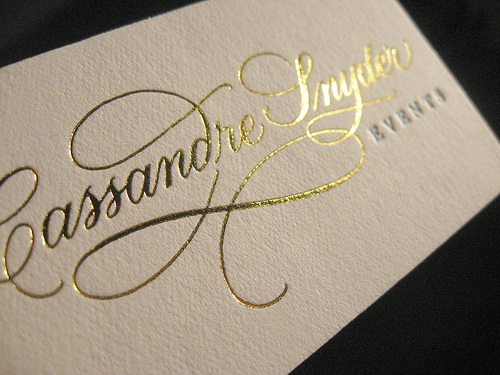
The method used above to create a gold shine on the text is called foiling.


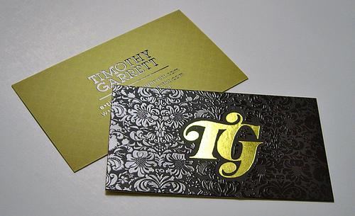
Above is a method which is called embossing, which extrudes the content through the stock, adding a raised look, a texture, something very unique.


The method seen above is screen printing - you can print screens. 


Letterpress, typesetting, as seen above. The type is constructed, set and then printed. 


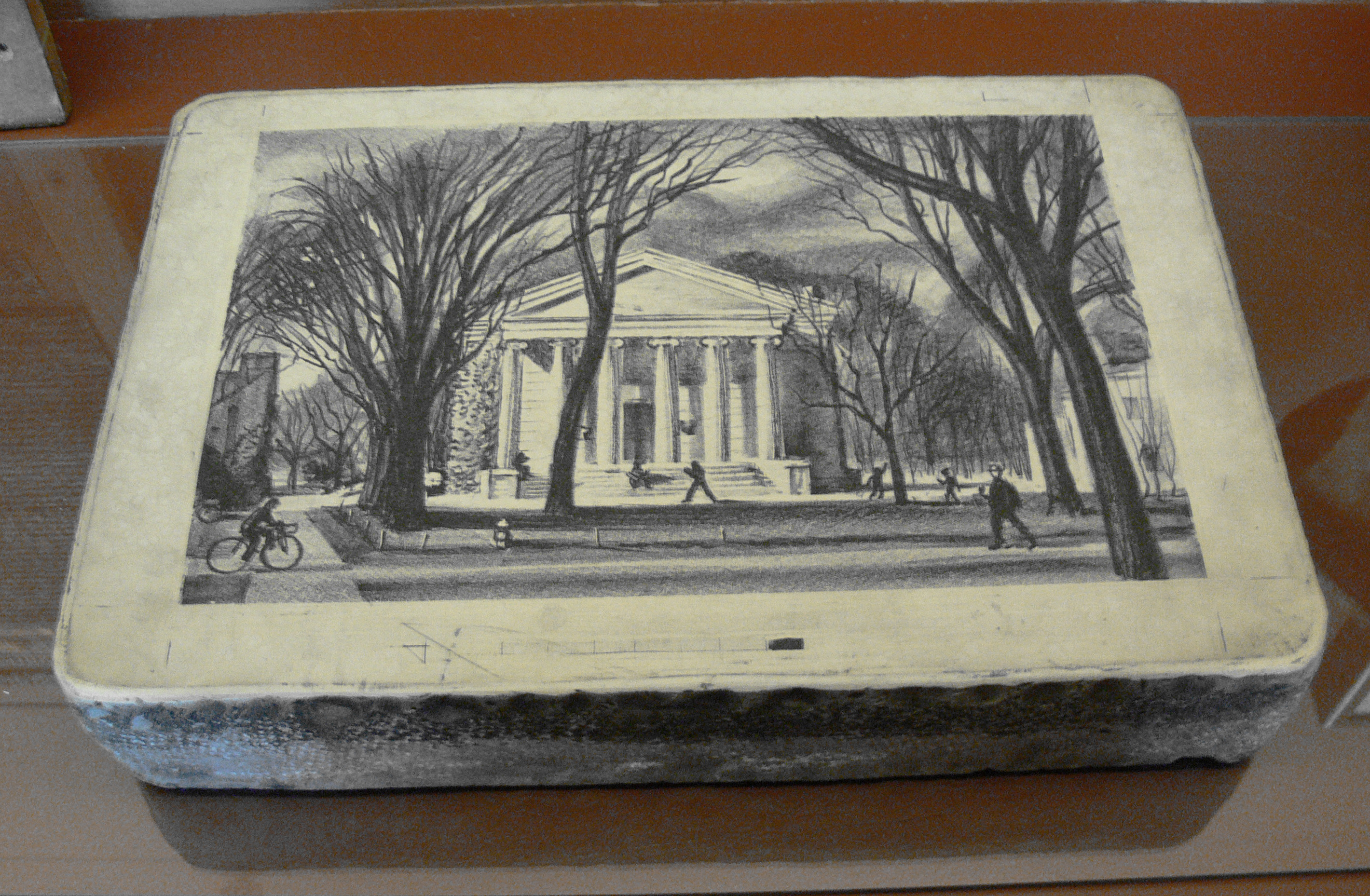
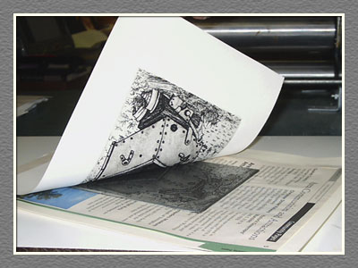
Lithography


Lino cutting, a process where you remove parts of a sheet of lino to create an image, which is then printed. 


Mono-printing.


Etching.


UV Coating


Die cutting


Duplex Printing


OUGD504: STUDIO BRIEF 2 - Design for Web // Minimalist Web Design


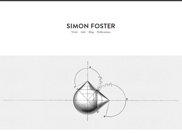
http://studionudge.com/


http://simonfosterdesign.com/home/


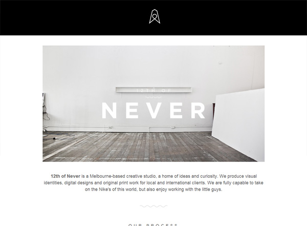
http://12th.ofnever.com/


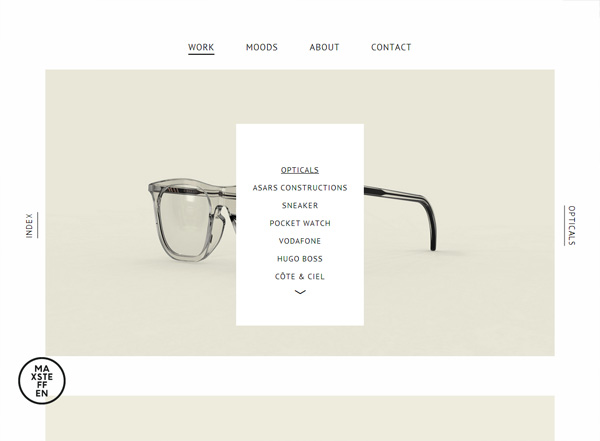
http://maxsteffen.com/


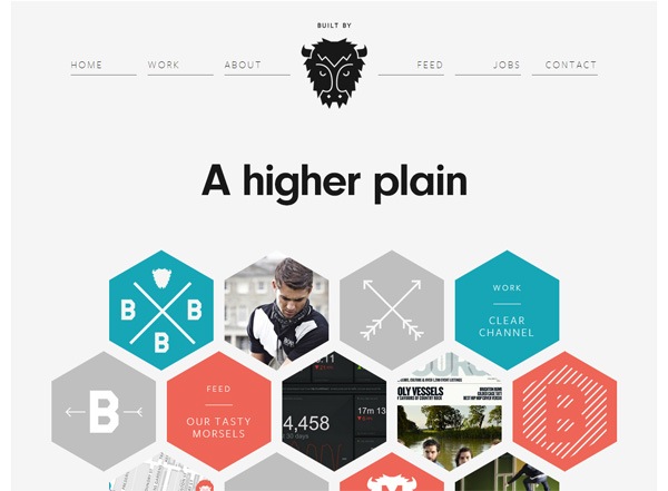
http://builtbybuffalo.com/


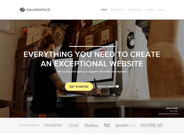
http://www.squarespace.com/


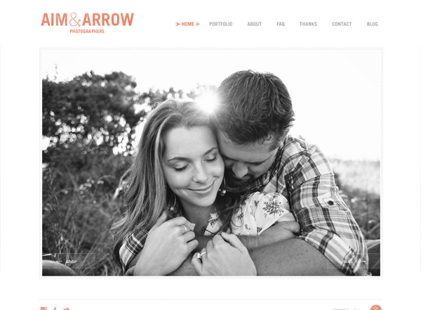
http://aimandarrow.com/


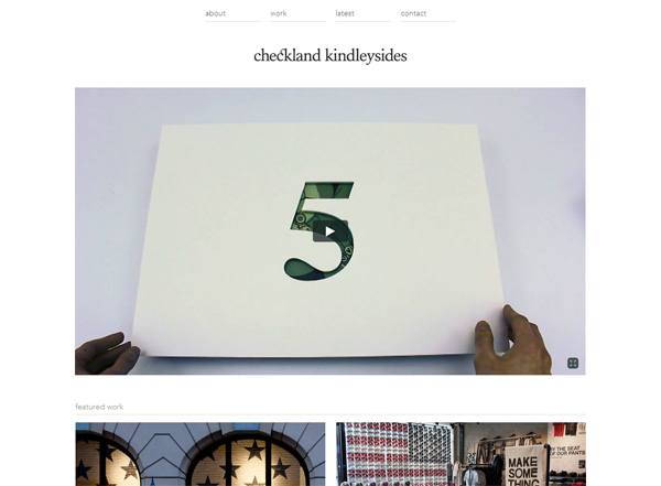
http://www.checklandkindleysides.com/


http://www.fearthegrizzly.com/

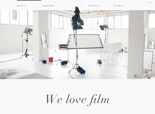
All these websites could be described as minimalistic websites, they all have a limited colour set, are centrally aligned, and dynamic. They all have a sense of quality about them, they feel well engineered, coded properly and efficiently. They all work fantastically. They're clear and have an element of sophistication about them. Which is what I want, as my subject is James Bond. 


PPP1: STUDIO BRIEF 2 - It's Up To You // Info packing Research

For this PPP1 project we have to Design, develop and produce an information pack that effectively communicates or promotes you as an individual, designer and learner. You will need to reflect on the first year of the programe and aim to communicate what you have learned, the skills you have developed and how you see yourself applying them in the future. You should  also aim to communicate the context of your interest by referencing specific designers, studios, principles and audiences where necessary. 

We should use this brief as an opportunity to explore, develop and demonstrate content, processes and areas of design that interets you at this point in time and may indicate your emerging creative concerns in Graphic Design.

I'm going to use this post to explore examples of creative self promotion, and perhaps tie some ideas together to inform my own design for my self promotion pack. I hope to look at general self promotion packs, packaging design, business card design and perhaps even some creative CV designs, which I've seen a few times before. 

Jon Cleave's Self Promotion Package


Selma Roberts' Self Promotion Package


Matt Ludvigson's Self Promotion Package


Copyright 2010. All rights reserved.

RSS Feed. This blog is proudly powered by Blogger and uses Modern Clix, a theme by Rodrigo Galindez. Modern Clix blogger template by Introblogger.