Showing posts with label Product Range & Distribution. Show all posts

OUGD505: STUDIO BRIEF 1 - Product, Range & Distribution // Packaging Design


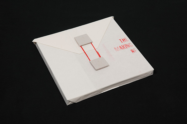
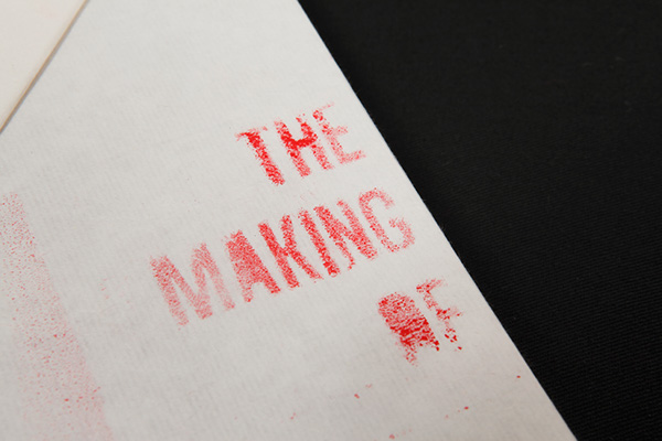
http://www.behance.net/gallery/The-Making-of-Chinese-Seals-(Book-Casing)/8944405


http://www.behance.net/gallery/The-Mystery-of-Broken-Glasses/2016805


http://www.behance.net/gallery/Exclusive-Book-Packaging/14441119


http://www.behance.net/gallery/Omnom-Hand-Crafted-Chocolate/14006337


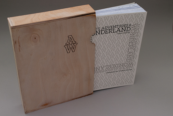
http://www.behance.net/gallery/Alices-Adventures-in-Wonderland/282112


http://www.behance.net/gallery/Tipping-Point/8851633

OUGD505: STUDIO BRIEF 1 - Product, Range & Distribution // Further Layout Research

Following the layout scamps, I'm doing further research into layout design, as I want to have a more informed layout design concept before I design the final layout designs. 


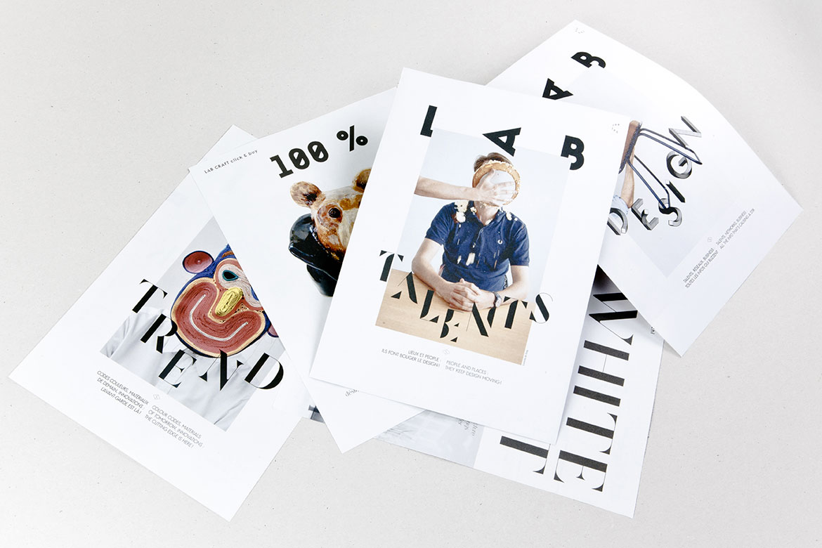
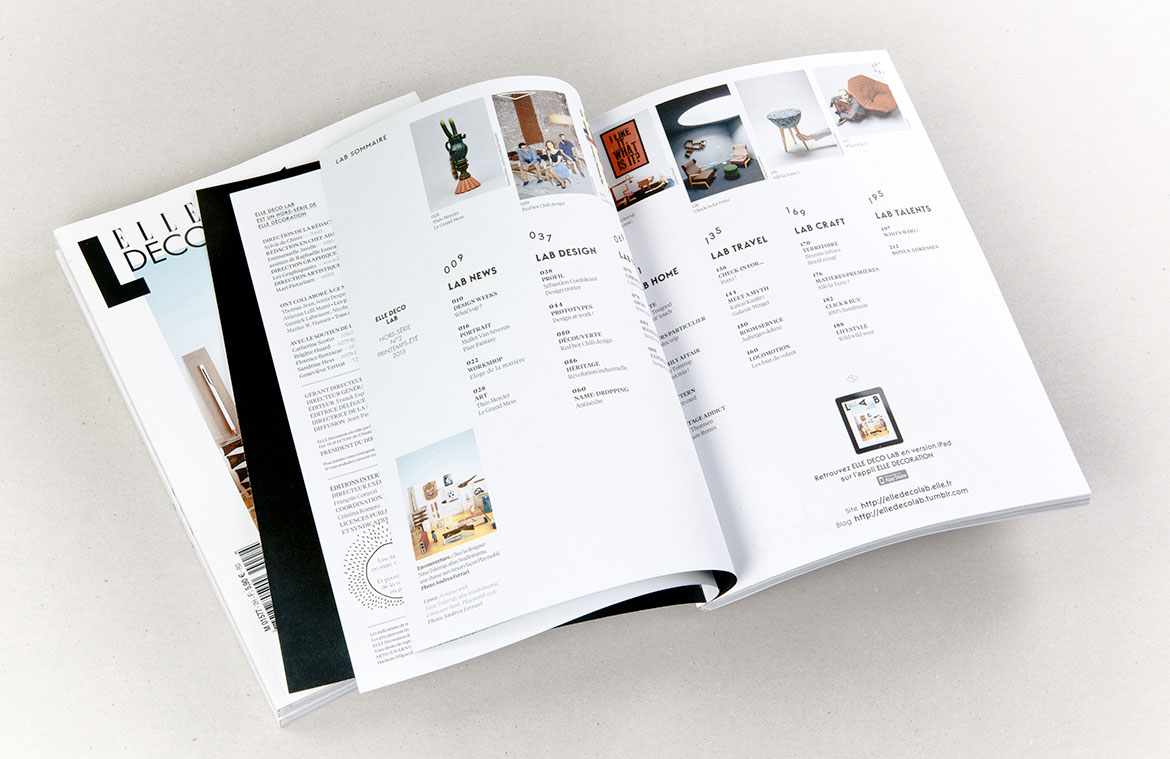
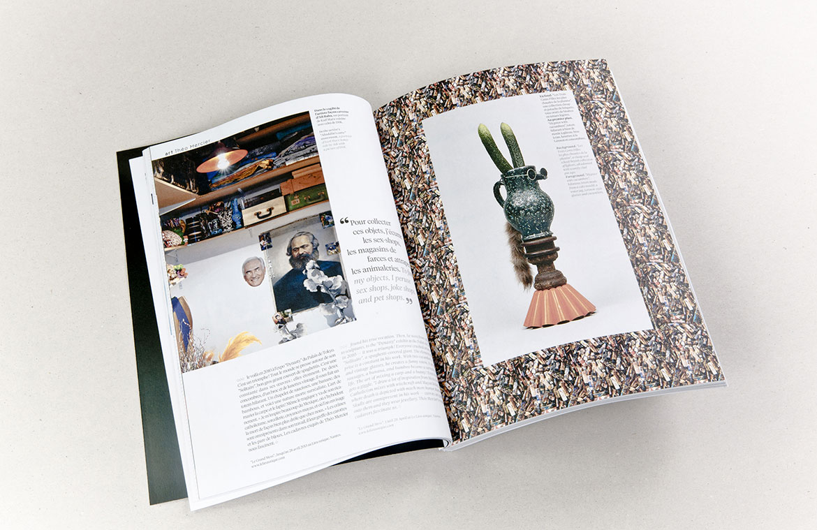
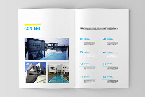
The first example of layout design uses an eight column layout, which is then used to create 2-4 columns as a structure. The gird also seems to be used to implement images into the design. http://www.les-graphiquants.fr/#!/elle-deco-lab-n2


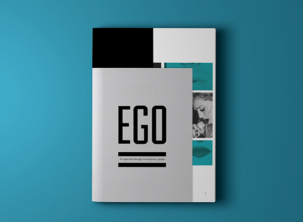
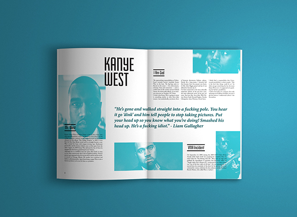
The magazine above uses a six column layout, which is used to split the page in two, devoting 3 of the six to a column of text on some of the pages, which is used to create two columns of text, or in other instances, the six are divided into a three column layout, using two columns for each column of text. http://www.behance.net/gallery/Ego/9747679


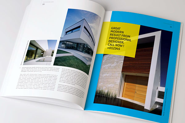
The layouts above use a two column layout, with a larger margin on the outside of the pages. The two columns are of different sizes. http://www.behance.net/gallery/Architecture-magazine-template/12149397


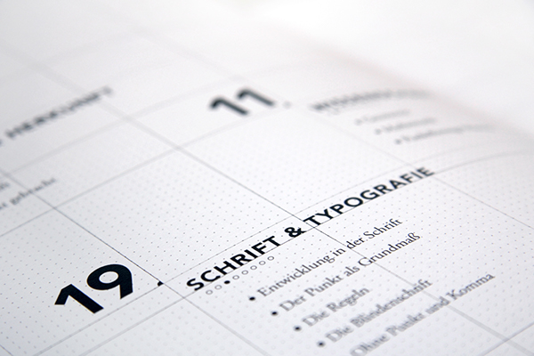
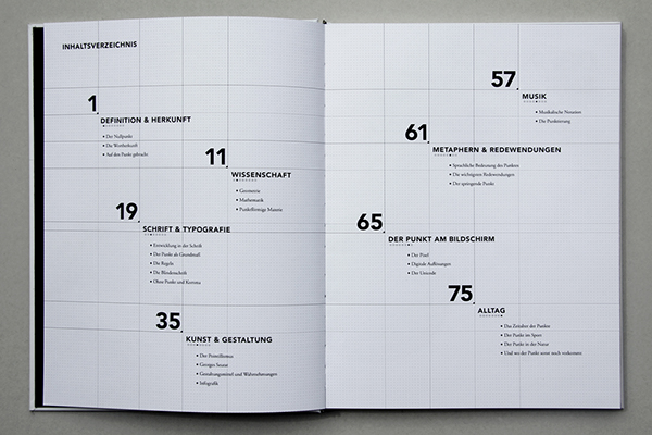
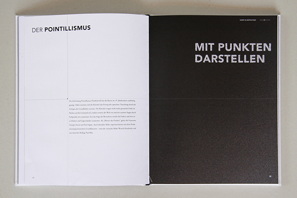
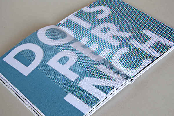
The publication above, actually has a page which features the design and layout on on the pages, with a visible grid. It uses a six column grid throughout, and bases the type and image using the structure. http://www.behance.net/gallery/Punkt-book-design/10756219

OUGD505: STUDIO BRIEF 1 - Product, Range & Distribution // Book Binding Research

Due to the restrictions of the brief, It may be difficult to bind the book on a grand scale, like you would a larger book. The publication to which we must create has to be sixteen pages in length, plus the cover. Because of which, I might be able to get away with some quicker methods of binding. However, I'm researching into a few of the possible methods to bind a small publication.


The example above is staple binding, it's useful for small publications, however due to the staple pins, you can only use a small amount of pages. Any more than 10, might be an issue. They do have a quite clean quality to them, an easy, almost modernist (function before form) ideal about it. 


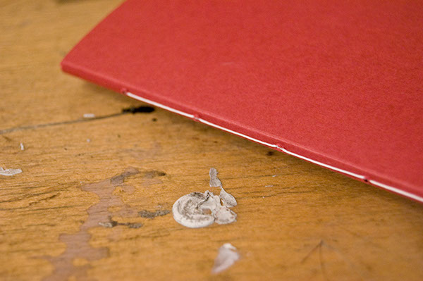
Saddle-stitch is another method on how to bind a small publication, the stitch method is a traditional way of binding, and if done with care, it can look extremely effective. It would tie in the traditional and attention to detail which you see with Aston Martin.


Perfect binding is another method of binding a publication, which can be applied to various scope of publications in different formats. I've perfect bound before, and it's fairly tricky to pull off successfully, however, it can be done with patience. The professional appearance associated with perfect binding might be useful, attributing to the class associated with Aston Martin. 

OUGD505: STUDIO BRIEF 1 - Product, Range & Distribution // Further Publication Research

I'm looking more into publications, however, now I'm looking in a more focused direction on how I would like my publication will look, I feel a cleaner more sophisticated look would suit my content, rather than a brash, cheap look. Of course, as I've discovered from previous endeavours, when you're designing to a minimal clean style, you must use a quality stock, to assure the design feels premium, if I were to print onto printer paper, the quality would appear flawed, and the design would look extremely cheap. The opposite of the look I'd like to achieve. 


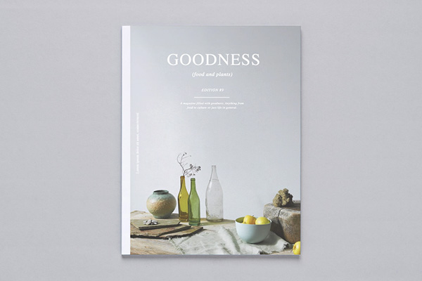
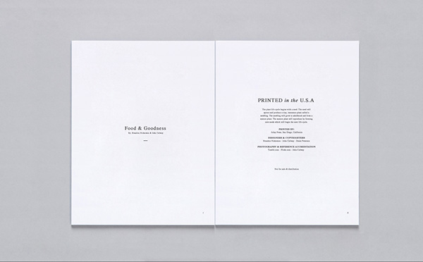
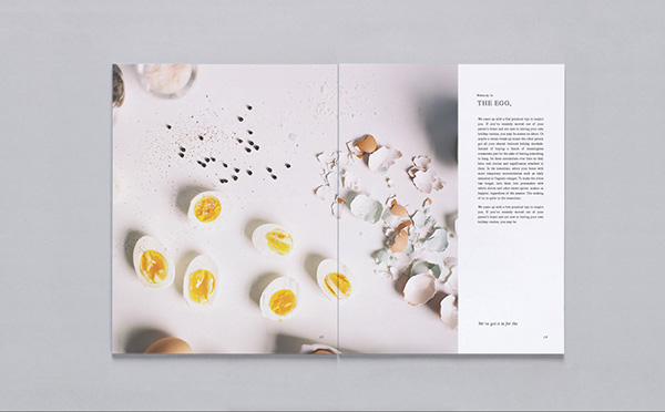
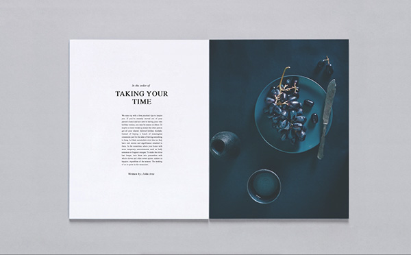
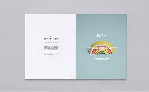
The publication above, shows an how might utilise the space in my Aston Martin Racing publication. The text is split into a three column layout, justified on both sizes, usually centralised. There is a vast amount of space around the text, which works, I think, It looks minimal, refined, the use of grids makes it appear well designed, crafted with care. The publication devotes spreads and leaves to full image images, which work really well in contrast the the white, minimal pages around it. http://www.behance.net/gallery/Goodness-Magazine/13415323


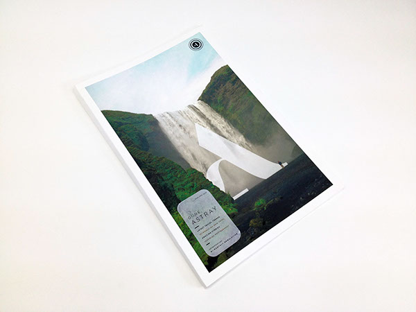
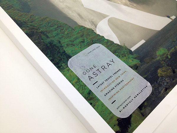
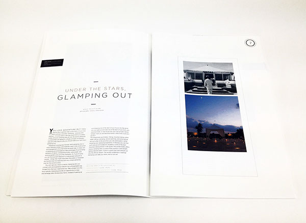
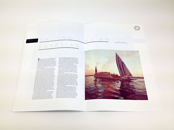
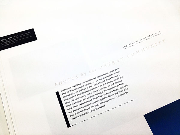
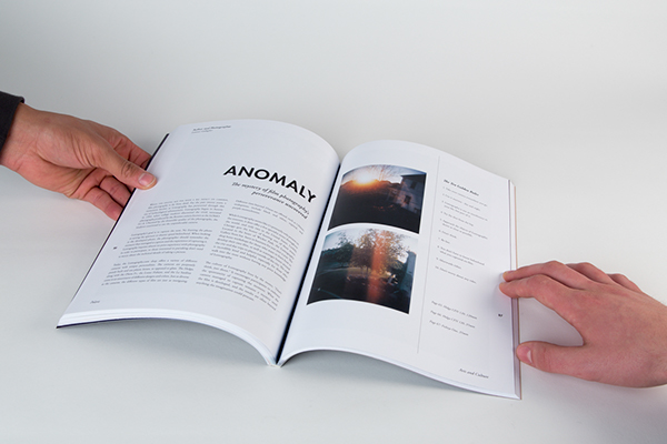
The publication above uses a similar minimal, white space efficient layout. The pages offer large space for imagery, which works well, in contrast, with the page layouts throughout the rest of the publication. The publication, throughout, also uses black strokes, dotted and thick, to separate and divide proportions of the page, such a paragraphs, headings and subheadings, the weight and style of the stroke differs depending the importance of the copy to which it accompanies. It's an interesting way of establishing hierarchy, typically you would alter the weight of the type, or change the font, or even typeface, to allow the copy to stand out, or not, to the designers taste. http://www.behance.net/gallery/Astray-Travel-Co-Bi-Monthly-Newsletter/9116255


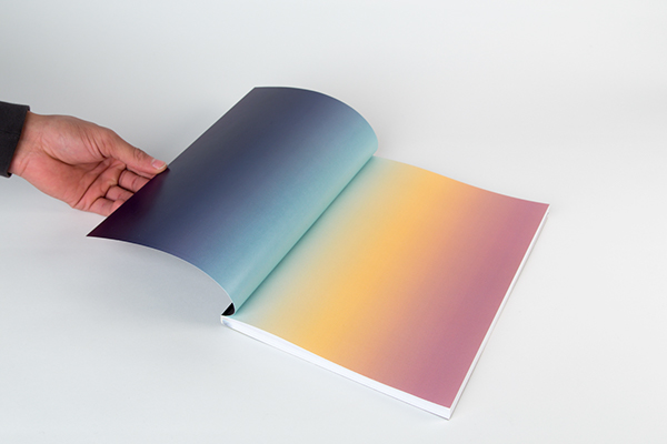
Another example of a publication which adopts the minimal design throughout, also using strokes, rather thin in this example to separate type and image. Some of the pages are devoted to large images which clash with the layout, for example, the first and second spread is just a gradient. I don't think it works in my opinion, I feel an image would have worked better, it feels rather brash, in my opinion.  http://www.behance.net/gallery/Polaris/13044111


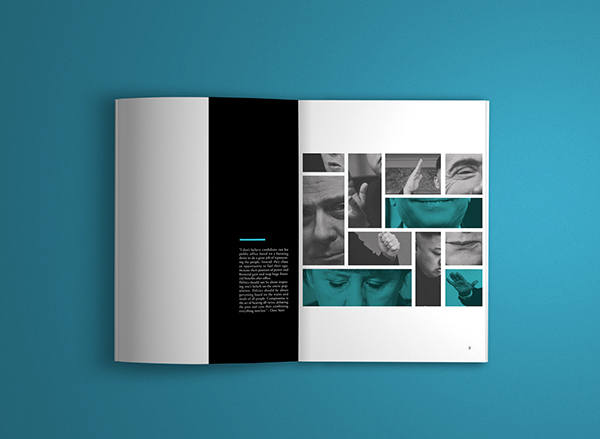
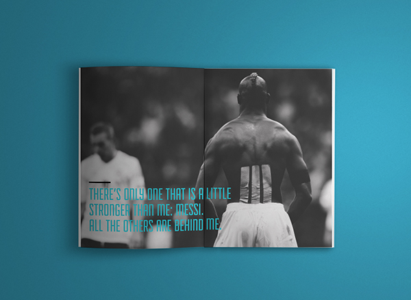
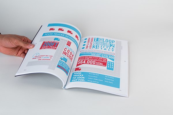
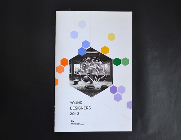
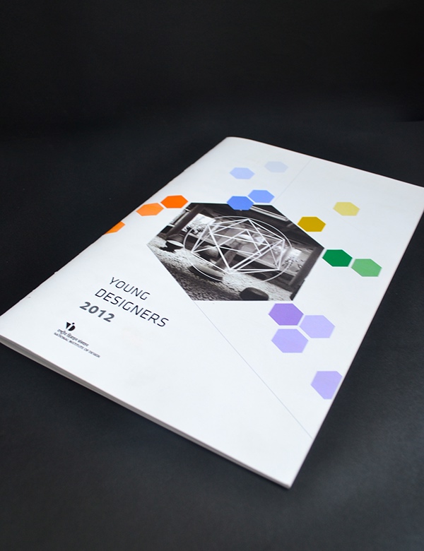
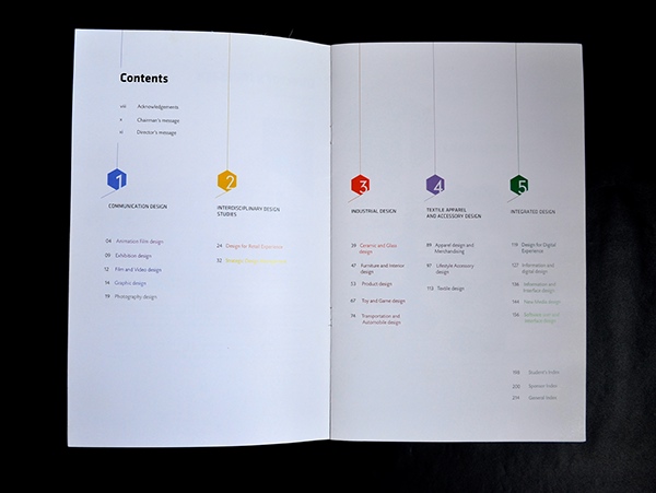
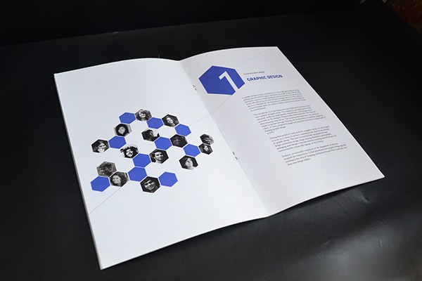
The final publication I've decided to look at is a small publication, a similar format to how mine might look, due to the requirements of the brief. It uses a diverse, but consistent colour palette throughout, uses for headings and illustrations. http://www.behance.net/gallery/PUBLICATION-DESIGN/6753955
 

Copyright 2010. All rights reserved.

RSS Feed. This blog is proudly powered by Blogger and uses Modern Clix, a theme by Rodrigo Galindez. Modern Clix blogger template by Introblogger.