To create a publication, it's wise to look into the design of other publications, how they work as a whole, and the consistent themes and layout designs which run throughout the publications. How the images work with type.


Another Escape: Volume 2, is a creative publication, which discusses various creatives, their feats and works. The publication uses large images throughout, showing the scale of the creativity by illustrating their works through image. The type alternates between two and three columns of text throughout, the type is right hand justified throughout, a very clean and consistent layout. http://anotherescape.com/volumes/volume-2/


The first instalment of the Another Escape Publications, this publication also uses large wonderful images, and double page spreads. Working with two and three columns per page. The layout's attention to detail and simplicity is wonderful. The images used have a very dull tone to them, which allows them to work well with the white pages, in unison with the plain roman font copy. I can't express how much I like this style of design. http://anotherescape.com/volumes/volume-1/
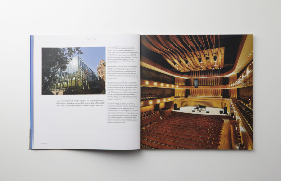


Looking at this publication, adopting an irregular format, that of an equal height and width; a square. large images throughout the publication. Using a three column grid, with large margins around the outside of the text boxes. Some columns for lesser important text, such as captions for images. http://pepper-cinnamon.net/dreams-magazine

Leave your comment