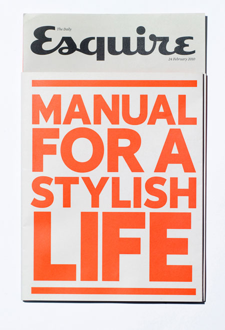
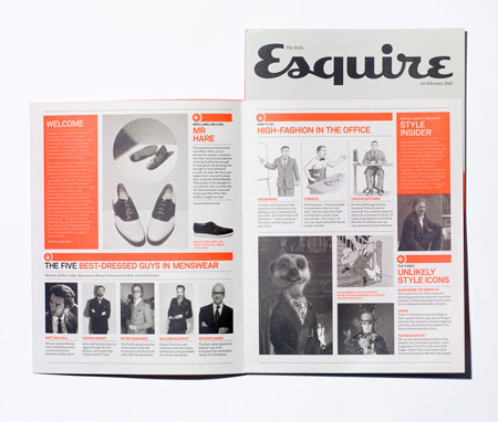
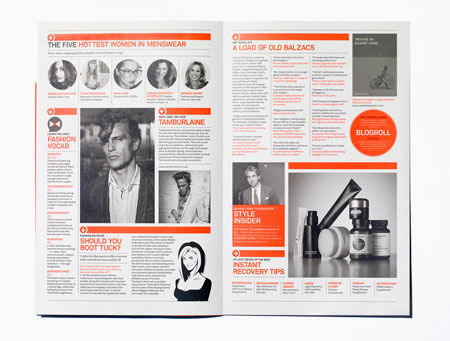
This publication uses black and white throughout, with an almost signature orange, as a highlight, throughout. The contrast works extremely well, it adds some definition and some style to the publication, ridding it of a plainer, more boring method of reading information.
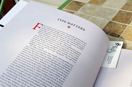
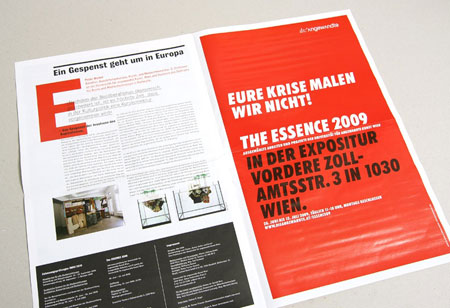
This example uses red as a logo, in the top of the page, and on the larger F at the start of the first paragraph, whilst using plain black body copy on white stock. The red pops in contrast to the plain looking page.
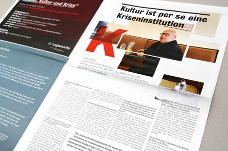
This publication uses red. It's used as a background for one of the leaves, and as an overprint colour for a letterform when titling a page. See the K, for example, on the second image. It overprints and image.
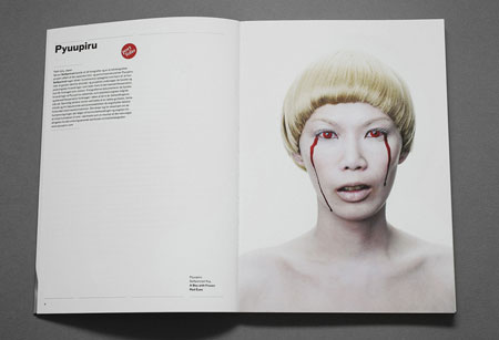
This example uses colour sampling, or even photo-manipulation, to create a constant red which is used throughout the publication. So there is a tie-in between the copy and the image, a form of constancy, throughout the magazine.

Leave your comment