OUGD503: STUDIO BRIEF 1 - Individual Practice // OAC Photography - Existing Branding and Idenity

As part of my research, I've looked into OAC Photography's current branding and promotion. To get an idea of what I'll be recreating, and the style which Olivia, the photographer is more accustom to. 


The original logo/watermark which she uses on her Facebook uploads. It looks alright, actually. It's a nice bit of typographic manipulation. Although, I think it's hard to distinguish the O from the C. 


This is OAC Photography's Facebook page. It doesn't really demonstrate any formal branding, other than the watermark in the bottom right. I think some branding could take this small business to the next level. This shows me one of the styles what OAC Photography uses, which is colour selection on black and white. So perhaps a one colour black and white colour scheme might be effective.


Finally, we have the Instagram page, like the Facebook page, it's brand-less, a brand image running consistently throughout, to make it look more professional. 

OUGD503: STUDIO BRIEF 1 - Individual Practice // YCN Fedrigoni Initial Calendar Research


Above is a really interesting style of calendar, it features unknown and rather odd days of celebration, such as 'spicy dish day' and 'mongrel day' using typography to create and image out of the date. Which is very playful and fun. Unfortunately the format of this calendar doesn't really fit my needs for this brief, as this is a static wall calendar, I need a desk calendar. http://www.etsy.com/uk/listing/171390085/sale-buy-one-get-one-free-2014-wall?ref=shop_home_active_1


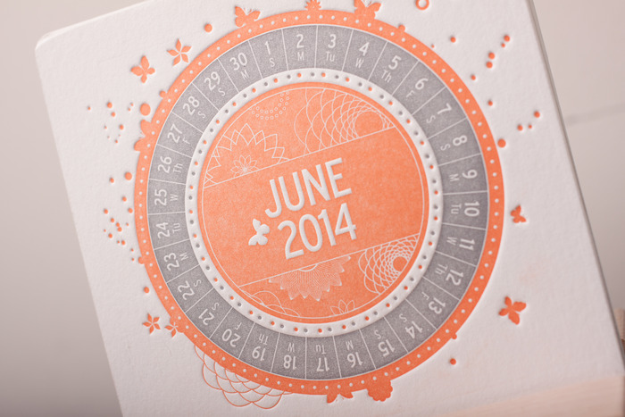
http://www.kickstarter.com/projects/letterpressshoppe/colourful-a-letterpress-desk-calendar


http://www.behance.net/gallery/FARBFAECHERKALENDER-2014-COLOR-MATCHING-CALENDAR/11188017


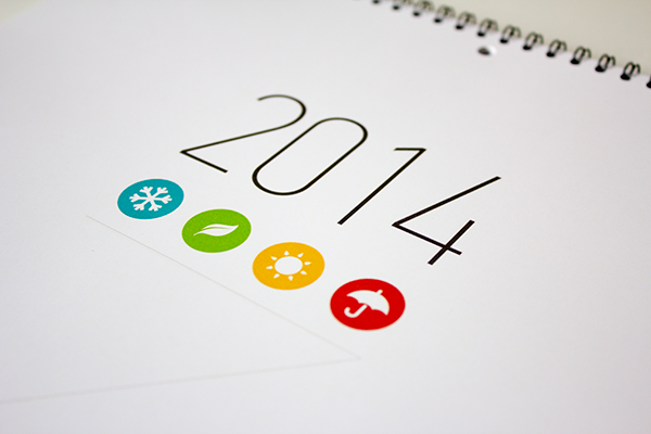
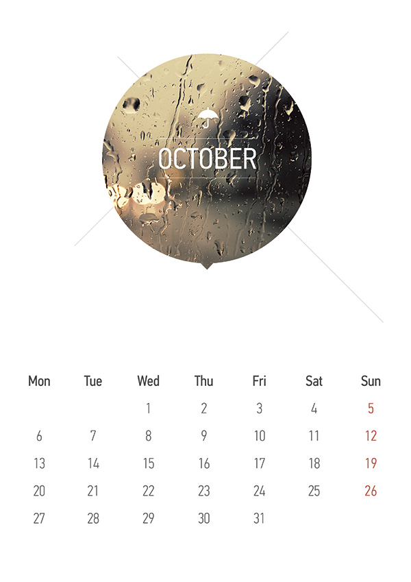
http://www.behance.net/gallery/Calendar-2014/9101801


OUGD503: STUDIO BRIEF 1 - Individual Practice // No. 7 Antiques Business Card Research

The main part of this collateral, is the business card. It's how the potential customer of client will remember you. You want to add something rememberable. I'd like to letterpress my business cards, however I need to research to find the best business card design.


The business cards above are typically unconventional. You find that business cards are usually horizontal, as are the rest of the examples below, this set of business cards are vertical. 


Some letterpress de-bossed business cards, printed on a thick white stock, they look really high quality and professional. 


OUGD503: STUDIO BRIEF 1 - Individual Practice // No. 7 Antiques Further Research

On the premise of my previous research, I have began to develop my ideas on design practice with the stationary range I would like to produce. I've begun to look at branding which uses the same elements which I plan to use, and some branding which uses some of the processes I would like to use. 


Adding some texture to a business card would be a good feature to add to this project. It implies quality and care, not just any printed design on a card. It's a personal touch, knowing that they're likely handmade. 


Another part of this branding is the wax seal, it's a symbol of elegance and sophistication, an extremely traditional device, not commonly used. Something I'd associate with an Antiques shop. 


Above is an example of a business card Letterpress de-bossing. It has a very professional quality to it. 


More examples of Letterpressed business cards, they're very similar to what I would like to produce for my own business cards. 


OUGD503: STUDIO BRIEF 1 - Individual Practice // Fedrigoni Previous Promotion Collateral and Woodstock Range

I'm researching into the previous promotional collateral for Fedrigoni and previous calendars which they have used. I'll be using this to inform my ideas and the design process, seeing what has done and what hasn't been done before. 


The calendar above uses cut outs of the date, which stands upright, for easy visibility, whilst allowing you to see the colour of the paper underneath. 


This example uses various different colours of the Woodstock ranges' stock. It also uses spot varnish which lines up on all the different publications. 


Origami, using different tones within the blue colour range to create a tuxedo out of Fedrigoni's paper. It's extremely impressive, although it's something I'm not sure I can do myself. 


The following is a small publication promoting Fedrigoni's Woodstock range. It has created a crater by cutting a hole in the stock, getting smaller each time, allowing you to see the paper underneath. 


Unfortunately, this was the ONLY image I could find of the Woodstock range on Fedrigoni's navigable website. It shows the colours and the quality - kind of. 


Two promotional publications which use Fedrigoni's range throughout. They all look very interesting, and they all use the full range of Fedrigoni's stock, as you can see with their broad range of colours. 
 

Copyright 2010. All rights reserved.

RSS Feed. This blog is proudly powered by Blogger and uses Modern Clix, a theme by Rodrigo Galindez. Modern Clix blogger template by Introblogger.