OUGD505: STUDIO BRIEF 1 - Product, Range & Distribution // Layout Design Research

I'm going to look at more variations of publications, however, in this post, I'm going to be looking more closely at the layout design of the publications. Picking out small bits which work, and small bits which don't, in hope to apply them to my design. 


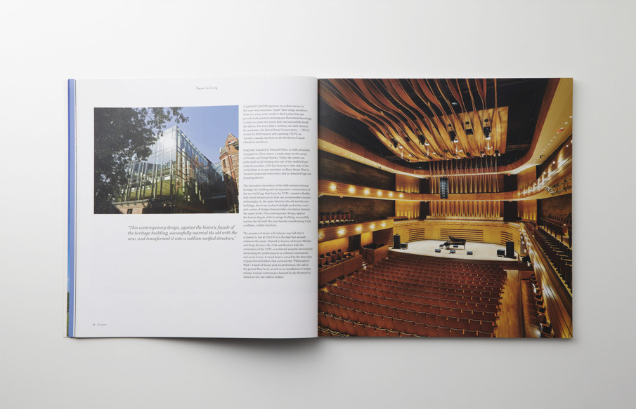
Some more work from Pepper Cinnamon. This magazine's layout is quite clean. For the type, it seems to use a two column layout. However, the images seem to be created in a sub grid, which is split down into many more grids. The publication also uses full double page spreads for beautiful imagery. http://pepper-cinnamon.net/TERROIR-Magazine-No-2


A far simpler layout design, one centralised column of text, justified to the left, with inserts for extra external content. It looks very clean and consistent throughout. http://www.lottanieminen.com/graphic-design/years-1-to-4/


These layouts follow a two column style throughout, with fixed margins on their side throughout the publication. On some page, a centre justified single column of text which runs to the widths of the pages, in the existing margins occurs. It's a really strong design, consistent and clean. http://www.behance.net/gallery/Geiger-Magazine/4507389


Another publication using three columns with variable widths. The two columns to the inside margins are wider than column on the outside margin. I've not seen this too often, it works rather well, i think. The text seems to be positioned on the lower two thirds of the page, leaving the upper space for a heading or an image to complement the type and layouts. http://www.nickivanroon.com/projects/taenk-magazine/


This layout following a two column structure, which is often broken my images and headings, which either fill the page or are centre aligned. The full images work really well with the clean design.  http://www.olschinsky.at/print-editorial/nevertheless-01

OUGD505: STUDIO BRIEF 1 - Product, Range & Distribution // Publication Research

To create a publication, it's wise to look into the design of other publications, how they work as a whole, and the consistent themes and layout designs which run throughout the publications. How the images work with type. 


Another Escape: Volume 2, is a creative publication, which discusses various creatives, their feats and works. The publication uses large images throughout, showing the scale of the creativity by illustrating their works through image. The type alternates between two and three columns of text throughout, the type is right hand justified throughout, a very clean and consistent layout. http://anotherescape.com/volumes/volume-2/


The first instalment of the Another Escape Publications, this publication also uses large wonderful images, and double page spreads. Working with two and three columns per page. The layout's attention to detail and simplicity is wonderful. The images used have a very dull tone to them, which allows them to work well with the white pages, in unison with the plain roman font copy. I can't express how much I like this style of design. http://anotherescape.com/volumes/volume-1/


Looking at this publication, adopting an irregular format, that of an equal height and width; a square. large images throughout the publication. Using a three column grid, with large margins around the outside of the text boxes. Some columns for lesser important text, such as captions for images. http://pepper-cinnamon.net/dreams-magazine

OUGD505: STUDIO BRIEF 1 - Design Production 2 // Study Task 1 - An Exhibition of Aston Martin - As Art

Following looking at the design of the cars, and how the follow an almost artistic nature, I decided to look at Aston Martin as art. Aston Martin have a gallery section on their website which show a range of paintings and illustrations relating to Aston Martin and it's production. Some of them are simply fantastic. 


The image above is white white circles on a green background, but what It relates to is the livery of the Aston Martin DB1. You can see below the ominous white circle on the front of the Aston. The green comes from Aston Martins connection with british racing. The British racing green. 


OUGD505: STUDIO BRIEF 1 - Design Production 2 // Study Task 1 - An Exhibition of Aston Martin - Design

As part of the research for this project, I'm narrowing down the board subject of Aston Martin, to a more precise, design of Aston Martin. 

Aston Martin DB9
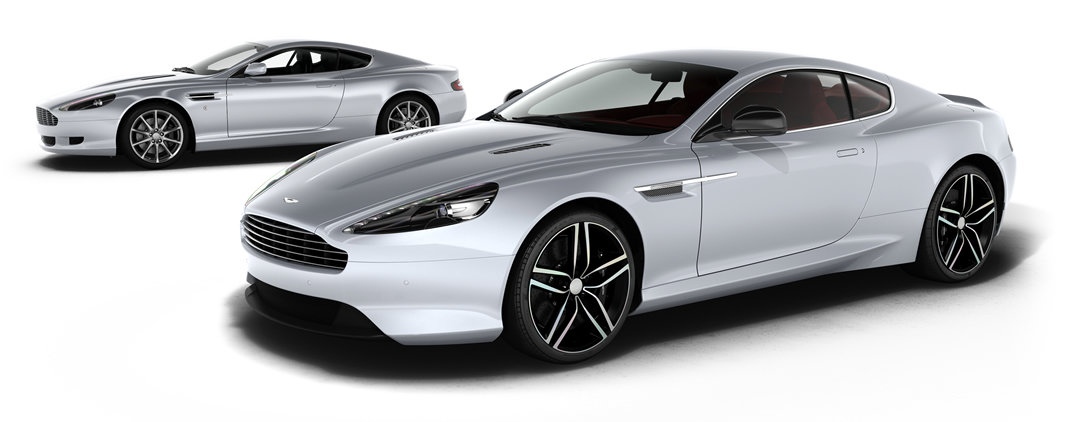
The concept image for the Aston Martin DB9. Hand rendered by one of Aston's designers. It's rather futuristic looking concept image, very different to the Aston's we see in production today.


The shots of the production car, it looks similar to the concept images, as it should, but looks like a more refined, realistic version of the concept. Less futuristic, almost held back. It's more like some visual inspiration, as you can certainly see how the two images look similar.  


In the first of four exclusive films, Design Director Marek Reichman explores the timeless elegance of the Aston Martin DB9. The contemporary embodiment of automotive's most famous model lineage, DB9 combines a purity of proportion and muscular prowess to create a compelling and iconic design.

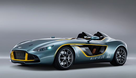
Aston Martin CC100


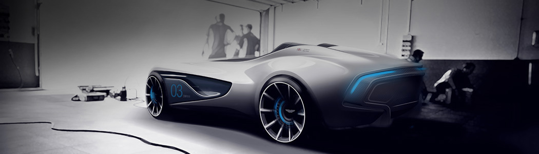
A rendering of the Aston Martin CC100 in a pit, or a workshop. A black and white rendering with the blue highlights, making the image look very futuristic. 


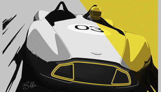
A contemporary illustrator of the CC100. 


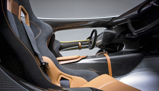
A sketch of the interior of the CC100, presumably from the initial design stage.


A video showing the design process and the production of the CC100 concept car. It's very interesting to see how it's done, from the designing, to sculpting a prototype, and to creating the car itself. It's very methodical and precise, showing the care and quality when crafting an Aston, as opposed to the machine lines you've seen in factors for larger scale production cars, such as Ford. 


Shots of the finished Aston Martin CC100, for comparison against the design photos. You can definitely see how they've got to this from the concept sketches and designs seen above. 

OUGD505: STUDIO BRIEF 1 - Design Production 2 // Study Task 1 - An Exhibition of Aston Martin

Aston Martin as 'Fine Art'

Photographer Philippe Shangti the famous Tropézian photographer known for his huge art and completely crazy works, was chosen by Aston Martin to illustrate an event also unusual: "100 years of the brand".


The video shows some of the works from this rather obscure photographer, celebrating Aston Martin's centenary in 2013, using a series of abstract photos. It's very different from what you would typically associate with Aston Martin. Their clean contemporary design, which runs throughout their range of products, appealing to a high level of class. 


I don't even know.

OUGD505: STUDIO BRIEF 1 - Design Production 2 // An Exhibition of Aston Martin - Primary Research Car Fest North 2013

Over the summer break, I was lucky enough to be able to attend Car Fest North 2013, due to my genuine interest in Aston Martin, I got a large amount of pictures from when I saw the Aston showcase.


I grabbed this image the day before we were allowed in the pit lane, separated by a barrier. From left to right, we have the Aston Martin 2013 Vanquish, with the special centenary livery, the one of seventy-seven, Aston Martin One 77, 2010, Aston's million pound car, and on the right, the internationally recognised Aston Martin DB5, 1954, this exact car was used in the production of Skyfall (2012).


Some crowd shuffling later, and I was able to get a better shot, to the right of the DB5 you can see the DB4, the predecessor to the DB5. 


As close up of Aston's One 77. 


A close up of the DB5 used in Goldfinger and Skyfall. 

On the final day of the festival, Aston had their Centenary Parade, where around 50+ cars, at least one of each model of Aston circled Outlon Park's circuit, majestically for half an hour. It was truly a sight, 100 years of gorgeous engineering. Unfortunately, my phone and DSLR had indeed died by this point, so I googled these images from the event. 


Copyright 2010. All rights reserved.

RSS Feed. This blog is proudly powered by Blogger and uses Modern Clix, a theme by Rodrigo Galindez. Modern Clix blogger template by Introblogger.