OUGD504: STUDIO BRIEF 2 - Design for Web // Limited Colour Palette Research

I want to use a limited colour palette within my website. It holds form of sophistication, class and style. Which is what I think I need for my website, to communicate the conventions of James Bond.


Using black and an off white colour and the basis for this website, with a touch of blue to really add some class and style to the site. I think it's really effective. 


This website used black and white as their base colours. They've sampled a yellow from cakes in the image, to use a highlight colour throughout the website, making it pop, almost. 


This website uses a simple black and white background, throughout. Quite well designed, fantastic use of grids. It uses red and yellow to make it pop. Add some vibrant colour selection to the website, the two colours and used throughout as almost highlights, to the content.  


OUGD504: STUDIO BRIEF 1 - Design for Print // Screen Printing in Books

I'd like to screen printing in some part of my book, wether it be on the cover, or the inners. I've found some examples of screen printing applied to books. One of wonderful things about screen printing, is that it adds a certain texture to the books. Some depth, as opposed to digital printing. 


The example above, it a screen printed book cover, for 87 Octane. The white ink can be applied to white when screen printing, and with multiple passes, you can almost make the white look solid. As opposed to the print on the right. Something which cannot be recreated with digital print. 


Above is the fully screen printed book, for Craig Oldham's democratic lecture, which I myself own a copy of. The whole publication has a wonderful texture, you can feel the type, throughout. It's printed on mount board, that with the textured text, really has a solid feel. 


These two books, which I assume are part of a range, due to the likeness, are two colour on stock prints. Using a base colour, the solid yellow or blue, with the back printed over the top. Their 'artistic' style allows the prints to not exactly be aligned and still achieve the desired effect. 


OUGD504: STUDIO BRIEF 1 - Design for Print // Limited Colour Usage in Editorial Design


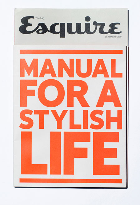
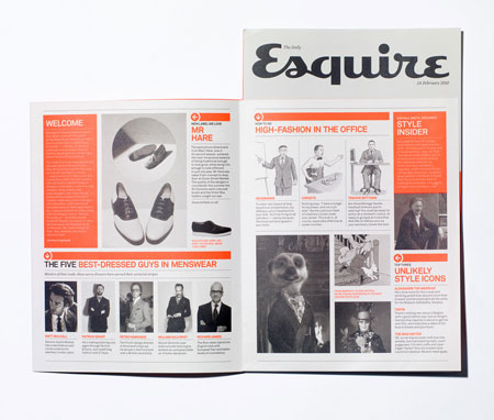
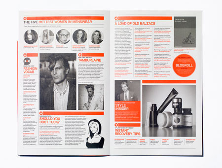
This publication uses black and white throughout, with an almost signature orange, as a highlight, throughout. The contrast works extremely well, it adds some definition and some style to the publication, ridding it of a plainer, more boring method of reading information.


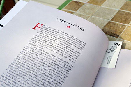
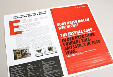
This example uses red as a logo, in the top of the page, and on the larger F at the start of the first paragraph, whilst using plain black body copy on white stock. The red pops in contrast to the plain looking page. 


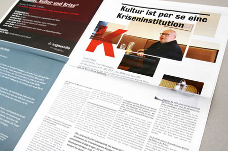
This publication uses red. It's used as a background for one of the leaves, and as an overprint colour for a letterform when titling a page. See the K, for example, on the second image. It overprints and image. 


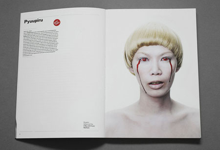
This example uses colour sampling, or even photo-manipulation, to create a constant red which is used throughout the publication. So there is a tie-in between the copy and the image, a form of constancy, throughout the magazine. 


OUGD504: Studio Brief 2 - Design for Web // Minimalistic Websites

I'm researching into some minimalistic, sophisticated websites. Following a studio critique, we established that my initial design was infact too cluttered, not really conveying the sophisticated-ness which you associate with James Bond.

http://www.kimag.net/


http://www.weltunit.com/en/


http://www.darcyjones.com/


http://www.rhythmrhythm.com/8.html


OUGD504: STUDIO BRIEF 1 - WHAT IS DESIGN FOR PRINT? // Info-Pack Initial Research

Before I begin to design some concepts for my info pack, I want to get a good range of variations, from which I can use to generate some ideas. In this post, I'll be looking at some info packs, and also some creative packaging - something to deliver the info pack in.

Below is an info-pack from another student, level 6 currently (2013/14) I believe.


OUGD501: Context of Practice 2 (Lecture) - The Gaze and the Media

Women internalise the gaze, they see themselves as they see images around them.
according to usage and conventions which are at last being questioned but have by no means been overcome - men act and women appear. Men look at women. Women watch themselvesbeing looked at’

Hans Memling - Vanity (1485) 
  • Impossible image of herself
  • There is no way they mirror can reflect that
  • He’s apportioning a type of moral judgement to the woman that is pictured
  • Triptych of Earthly Vanity and Divine Salvation (front) (c.1485) Oil on oak panel, 22 x 15 cm (each wing) Musée des Beaux- Arts de Strasbourg.
  • Using the mirror at an odd angle appears in many contemporary images, we can see a shadowy outline of her face - the fact she’s preoccupied means we have permission to gaze at her. 
  • A very vouyeristic approach
ALEXANDRE CABANEL ‘Birth Of Venus’ 1863
  • We’re left as the viewer to regard the naked body uninterrupted
  • She doesn’t stop us from looking, there’s no challenge to the gaze.
Sophie Dahl for Opium
  • This version of the advert was deemed to be too adversely sexual
  • It was too sexual, it wasn’t going to pass the advertising standards,
  • So to pass this, they turned the image on it’s side, so there’s more of an emphasis on the face, and less on the body
Titian's Venus of Urbino,1538
  • The look in this woman’s face is almost a sort of flirty imitating to allow you to look at her body. 
  • The position of her left hand could be argued that she was covering herself, but it could also be perceived as quiet sexual
MANET - ‘Olympia’1863
  • There’s a difference in the woman’s gaze, as apposed to Titian’s,
  • The hand position is significant, it’s not a modest sexual gesture, it’s stopping you looking at that part of her body
  • The woman is actually a prostitute, she’s a modern woman, a modern nude.
  • Manet is celebrating the powerful female figure
Ingres ‘Le Grand Odalisque’ (1814)
  • Informed the Guerrilla girls
MANET - Bar at the Folies Bergeres, 1882
  • if you look in the top right corner, you can see Manet, it’s almost like a self portrait.
  • The reflection you can see wouldn’t exist in reality, it’s obtuse.
  Jeff Wall ‘Picture For Women’(1979)
  • The woman repeats the vacant inactive look, in woman.
  • He’s divided the image into thirds using the mirrors,
  • you can see the camera, acting as the POV like Manet
  • You can then see Wall on the right, like you can see Manet in his painting
Coward, R. (1984)
  • The camera in contemporary media has been put to use as an extension of the male gaze at women on the streets,
  • The action of the camera replicates the male gaze,
  • Normalisation of the female form
Eva Herzigova, 1994
  • Wonderbra, normalisation of the female body in the streets, 
  • This appeared as a billboard in a high density area
Coward, R. (1984)
  • The profusion of images which characterises contemporary society could be seen as an obsessive distancing of women... a form of voyeurism
  •  Peeping Tom, 1960  
  • The male body can also be objectified as it would be with women.
  • From 2007, Dolce and Gabbana 
Marilyn: William Travillas dress from The Seven Year Itch (1955)
  • 1970’s she looked at 1950s and 1940’s films using Freudion theory, to look at how films are made, with female objectification 
  • Cinema was a darkened room, it’s notable that one may look without being seem, by those on the screen and others in the audience,
  • The Voyeuristic process of females characters and the narcissistic nature of egos in characters
Artemisia Gentileschi ‘Judith Beheading Holofernes’ - 1620,
  • In Griselda Pollocks ‘Old Mistresses’ 
  • A more active role for females
  • She wants to reposition the role of women in art history, making their work and their voices visible
  • Pollock, G (1981)
  • Women ‘marginalised within the masculine discourses of art history’
  • This marginalisation supports the ‘hegemony of men in cultural practice, in art’
  • Women not only marginalised but supposed to be marginalised
Cindy Sherman, “Untitled Film Still # 6”, 1977-79 
  • The woman in the image is in a reclining position 
  • Barbara Kruger ‘Your Gaze Hits The Side of My Face’ (1981) 
  • Your gaze hits the side of my face
  • Why can’t we look at a female body - she challenges that
  • Sarah Lucas ‘Eating a Banana’ 1990 
  • Sarah Lucas Self Portrait with Fried Eggs 1996 
  • She challenges the gaze
Tracey Emin ‘Money Photo’ 2001
  • Challenging the criticism, almost like some sort of prostitution
Caroline Lucas MP in June 2013
  • No More Page 3 - she was asked to remove it, because it was against the dress code of the house of commons, 
  • Challenging the gaze, against the objectification of women in page 3,
  • Lucy-Ann Holmes, who founded a campaign to end the publication of topless "Page 3 Girls" in The Sun newspaper last year, told the BBC that while she had also received death threats, she had not been subject to the level of "sustained attack" experienced by Ms Criado-Perez. "I'd say it's a constant undercurrent, when women write about feminist issues or are exposed in a lot of media for speaking out about sexism they tend to get a barrage of abuse and threats," she said. (www.bbc.co.uk)  

Criado-Perez campaigned to keep Elizabeth Fry on the £5 note 
  • Criado-Perez argued that as the Equality Act 2010 commits public institutions to end discrimination
  • She received up to 50 threats a day via Twitter including threats to rape and murder.
  • Although she reported the abuse police lost evidence and she was forced to delete her account 
  • Campaign to represent women on British currency

Social Networking is used to perpetuate the male gaze/ the gaze of the media
  • The body is broken into fragments- could be any female
  • Plays on teenagers body consciousness, potentially carrying those perceptions into adult life
 Susan Sontag (1979) ‘On Photography’
  • 'To photograph is to appropriate the thing photographed’
  • The act of photographing is more than passive observing. Like sexual voyeurism, it is a way of at least tacitly, often explicitly, encouraging what is going on to keep on happening’   
  • Paparazzi shot of Princess Diana
Reality Television
  • Appears to offer us the position as the all-seeing eye- the power of the gaze 
  • Allows us a voyeuristic passive consumption of a type of reality
  • Editing means that there is no reality
  • Contestants are aware of their representation (either as TV professionals or as people who have watched the show)
The Truman Show (1988) dir Peter Weir
  • His life, Jim Carrey’s character is in reality TV
Big Brother 2011    
  • Making Voyeurism an every day activity, 
  • They can’t see us, but we can see them, we are the peeping Tom. 
Looking is not indifferent. There can never be any question of ‘just looking’. - Victor Burgin (1982)

Further reading

John Berger (1972) Ways of Seeing, Chapter3

Victor Burgin (1982) Thinking Photography

Rosalind Coward (1984) The Look

Laura Mulvey (1973) Visual Pleasure and Narrative Cinema

Griselda Pollock (1982) Old Mistresses Susan Sontag On Photography (1977)
 

OUGD501: STUDY TASK 3 // CONSTRUCTING THE OTHER

http://www.dailymail.co.uk/sciencetech/article-2482751/Left-handers-likely-psychotic-Study-finds-strikingly-higher-chance-suffering-schizophrenia.html

The article chosen, displays a sense of othering, alienating a larger majority of the population. The article, from the Daily Mail, 1st of November 2013. The article, 'Left-handers 'more likely to be psychotic': Study finds they have 'strikingly higher' chance of suffering schizophrenia’ Which goes on to make bold statements such as 'Left-handers are more likely to develop psychotic disorders, such as schizophrenia, than mood disorders, research suggests’ - This statement is completely othering an entire section of the population, people who write with their right hand. The blind ignorance conveyed in the othering of right handers suggests that only people with who write with their left hand are more likely to develop some sort of metal instability. '10 per cent of those being treated for bipolar disorder or depression were left-handed – a figure much more in line with the rate of left-handedness in the general population.’ Surely, the other 90% percent of those who are being treated for a bipolar disorder or depression are infact right handed. The article also writes, another blind statement "Left-handed people have a ‘strikingly higher’ chance of suffering from schizophrenia, research suggests. ...A study revealed left-handers accounted for 40 per cent of those with the mental illness.” Which also supports; those who write with their right hand have been othered, as even in the statistic displayed, there is a larger proportion of the percentage unaccounted for, the right handers. So, 60% of people with mental illness are right handed. 

You could also argue that in this article, they are also othering the stable-minded left-handers. It doesn’t give a proportion of mental illness rates to the number of left handers. These statistics which they’re dug up are completely out of context, holding little relevance because The Daily Mail have othered the, what I assume to be, the majority, the stable minded proportion, of the left handed population. 

OUGD504: STUDIO BRIEF 2 - Design for Web // Good Web Design


USM Modular Furniture - http://www.usm.com/en-us/


Lodgify - http://www.lodgify.com/


A Clever Little Agency - http://www.madebyblock.com/


The Squad - http://www.thesquad.com.au/


Design Shopp - http://designshopp.com/

OUGD501: Context of Practice 2 (Seminar) - Identity

Recap from the lecture
  • Essentialism 
  • Physiognomy - the outlook, because people are born in a certain environment, having a certain identity. 
  • Anti-Essentialism - Society shapes us as people, and we don’t have any defining characteristics, but we’re formed by socialism.  
Identity and the other in visual representation
  • Creation of identities
  • concepts of otherness
  • Analysis of visual example
  • Identity - who we are and how others perceive who we are
  • Identity creation - What makes you, you?
  • The way you dress/present yourself
  • How you speak/mannerisms
  • Where you’re from
  • Level of social skills/who you surround yourself with
  • Interests
  • Upbringing/background/genetics
  • Physical Attributes (deformities)
  • Fear
  • Sense of Humour 
  • Skills and abilities/what you can do for society
  • Religion and Beliefs
  • Gender
  • Sexuality
How do you express your identity?
  • The way you dress/present yourself - conspicuous consumption
  • Your way of speaking
  • Life style choices
  • Body modifications
  • Job/Profession/Vocation
  • Emotional Availability 
  • Social Networking
  • Reality vs projected identity.
Circuit of Culture - Stuart Hall
  • Culture is the framework within which our identities are formed, expressed and regulated.
  • Identity formation
  • Process from psychoanalysis
Jacques LACAN
  • The ‘hommelette’ (french pun - man/omelette)
  • The ‘Mirror Stage’ - the key point of identity formation in the individual
  • The Mirror Stage
  • Sense of self (subjectivity) built on:
  • an illusion of wholeness
  • receiving views from others
  • Result = own subjectivity is fragile
Constructing the ‘other’
  • Problems: relives on the assumption of position and radical otherness
  • In the same way that we create our own identities we
  • Identification
  • Shores up unstable identities though the illusion of unity. 
  • Shared fashions, belief systems, values
  • — Subterranean Values (Matza, 1961)
Find an example of othering. 

OUGD504: STUDIO BRIEF 2 - Design for Web // Bad Web Design

Below, listed are some terrible examples, in my opinion, of web design, in no particular order. 


Evangel Cathedral // http://www.evangelcathedral.net/welcome.htm Plenty of flash based media, infinite loop media - appalling colour scheme, almost painful to view. It doesn't fit the context to which it was created.


Abbishek Designs // http://abhishekdesigns.com/#!/ I've never been a huge fan of the blown up stock images with grunge text thrown on the top, rasterized, then resized once again. On a more technical note, I'm struggling to find any use of grids, which are  fundamental to good web design. 


American Patriot Party // http://www.americanpatriotparty.cc/ Plenty of clashing colours. The content seems to be squeezed onto the home page, with plenty of links on the left side. It just doesn't work. 


Palace Fun Centre // http://www.palacefuncentre.co.uk/ (Probably hasn't been updated prior to Y2K) The content seems to have created to fit an academy ratio monitor, infinite loop gifs, and a wonderful gradient to set the scene. 


Copyright 2010. All rights reserved.

RSS Feed. This blog is proudly powered by Blogger and uses Modern Clix, a theme by Rodrigo Galindez. Modern Clix blogger template by Introblogger.