Showing posts with label DESIGN SKILLS. Show all posts

OUGD401: Lecture Notes - Advante-Garde Cinema


  • Richard Miles - richard.miles@leeds-art.ac.uk

  • In opposition to mainstream cinema.
  • A critical attack on Hollywood cinema, being different in everyday.
  • Non Linear/Non Figurative/Non narrative.
  • Open audience, rather than closed.
  • Requires a different kind of spectatorship.
  • Create your own meaning to the film.

  • 'Un Chien Andalou' (1929) Luis Bunuel.
  • Plot was constructed with Salvador Dali.
  • Surrealist feeling to the film.
  • Can be seen as a metaphor for the weight of the world, social and sexual oppression. 
  • Cremaster 3 (2002) Matthew Barney.
  • Starring himself,
  • He was going on a quest to climb the gugamhimeh, being stopped by show girls, and two american hardcore rock bands.

  • Spirals (1926) Oskar Fischinger
  • Playing with optics
  • Showed at the Bauhaus.

  • Lapis (1966) James Whitney
  • Bohemian
  • Synthetic sounds, creating by new electronic instruments which became popular in the 60s, as the 'new sound'.
  • People write about it as a form of poetry

  • Black Ice (1994) Stan Brakhage
  • physically modified the film stripes, scratching, painting, drawing.
  • Mothlight (1963)
  • made using the same process as Black ice.
  • Window Water Baby Moving
  • Attempts to make a hypnogogic feeling, the state between waking and sleeping. 
  • Nothing makes sense, but your brain is half conscious, feeling. 

  • Empire (-) Andy Warhol 
  • Static camera filming the empire state building for 10 hours.

  • All these films take the idea of cinema and remove it, and look at cinema from a new point of view. 
  • They're not made for money, so there's a feeling of honesty from them, however, since they're not made to make money, they're never shown.

OUGD403: Alphabet Soup - Illustrator: Research


"Times New Roman is a serif typeface commissioned by the British newspaper The Times in 1931, created by Victor Lardent at the English branch of Monotype. It was commissioned after Stanley Morisonhad written an article criticizing The Times for being badly printed and typographically antiquated. The font was supervised by Morison and drawn by Victor Lardent, an artist from the advertising department of The Times. Morison used an older font named Plantin as the basis for his design, but made revisions for legibility and economy of space. Morison's revision became known as Times New Roman and made its debut in the 3 October 1932 issue of The Times newspaper.After one year, the design was released for commercial sale. The Times stayed with Times New Roman for 40 years, but new production techniques and the format change from broadsheet to tabloid in 2004 have caused the newspaper to switch font five times since 1972. However, all the new fonts have been variants of the original New Roman font."


OUGD403: Sonar Vs Sea Life Research


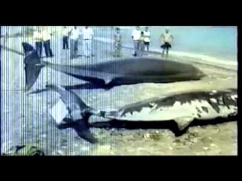
One of the directions I've decided to go in, following the crit, was research into sonar. The infograph above educates us how sonar from boats, submarines, tankers, affect marine life, messing with their navigation.


The second image, which is fairly grim, showing the result of sonar-abuse, a form of whaling.


Above is an example of a sonar reader, so we can see the sound which has bounced back towards us, helping us navigate, by informing the distance from objects.


However, I've also learnt that the sonar sound-waves mess with the whales' sonar, causing them to beach.

OUGD401: Love & Hate

Love


(Click to Enlarge) The above image is a fantastic piece of Graphic Design. The use of colour, limiting it to blues and greys for a simplistic design, a well thought out selection of fonts. I also think the vector banners add a nice quality to the image.


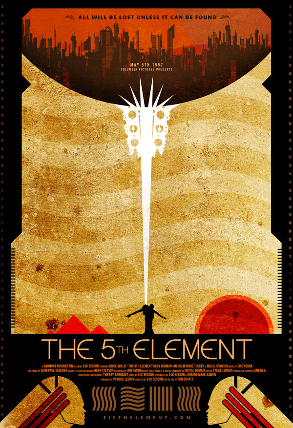
This is an alternative post to the 5th element. The use of warm colours, with the contrasting black and the striking white works extremely well in this image, the warm colours blending together with the harsh white being very in your face.


Hate


The above image is from "crap is good", which is a new style, which as you can see if pretty crap, the simple font, centre aligned looks okay, however the random architecture-style images thrown around the pages makes the entire book cover look poor. Crap is good? Crap is crap.


The above is another piece of Graphic Design i hate from crap is good. It's poorly designed, it looks cluttered  using lots of unnecessary hyphenations. The variation of fonts also throws me off, I do not like it.

OUGD403: Echolocation Research

For the newspaper article, I'm doing additional research on Echolocation. Whales are fairly renown for using echolocation, dubbed as whale songs. These are not usually detected by human ears, but Noc, the Beluga Whale, speaks several octaves lower than most other whales, detectable by human ears.


"Echolocation, also called biosonar, is the biological sonar used by several kinds of animals. Echolocating animals emit calls out to the environment and listen to the echoes of those calls that return from various objects near them. They use these echoes to locate and identify the objects. Echolocation is used for navigation and for foraging (or hunting) in various environments. Some blind humans have learned to find their way using clicks produced by a device or the mouth"


"Beluga whales have been called "canaries of the sea", and anecdotes of their capacity for mimicry have been reported in the past.[2] For example, the first two scientists to study the calls of wild Belugas wrote that "occasionally the calls would suggest a crowd of children shouting in the distance", and keepers at the Vancouver Aquarium said that a 15-year-old Beluga named "Lagosi" was able to speak his own name.[4] However, NOC's human-like calls were the first of their kind to be recorded.[5]
NOC's vocalizations were recorded and studied by a team of biologists from the National Marine Mammal Foundation (NMMF) led by Sam Ridgway. In 1984, Ridgway and others at the NMMF began to hear peculiar sounds coming from the whale and dolphin enclosure. They were reminiscent of two people talking in the distance, the words just beyond the limit of comprehension.[3] Later, a diver working in the enclosure came to the surface after he heard someone cry "out, out, out!"[1] After he asked his colleagues "Who told me to get out?", they realized it had been NOC.[5] They immediately began to record the sounds and reward him for the behavior, teaching him to make them on command. Eventually, they installed a pressure sensor in his nasal cavity to better understand the mechanism by which the sounds were produced.[5]
According to Ridgway, "They were definitely unlike usual sounds for a [beluga], and similar to human voices in rhythm and acoustic spectrum."[1] Unlike humans who use their larynx to produce sounds, whales use their nasal tract. Data gathered from the pressure sensors indicated that NOC was using his nasal tract as well, although he altered his normal vocal mechanics.[3] In particular, he over-inflated his vestibular sac, which is normally used to prevent water from entering the lungs.[5]
NOC's vocalizations were described during a conference in 1985, and in a 2012 paper by Ridgway et al. which appeared in Current Biology" 


OUGD403: Newspaper Article

For this assignment, we were asked to find a newspaper from Tuesday the 23rd of October 2012, and select an article to visually explore. The newspapers I've picked up were The Daily Mail, The Independent and The Guardian. 

The Article I've chosen

The Daily Mail Copy


The Independent Copy


I've decided to explore this article as I feel it has great potential for some really creative things. I could explore the biology-side of the story and do a deep analysis of the speech, cross sections and maps of the bodily systems which would be involved to aid in the whales speech. For example, something like the below:


"The whale’s sounds were produced in a way different from normal whale sounds.
Unlike echolocation clicks, ordinary pulse bursts, and whistle-like sounds, the production of speech-like sounds involved marked inflation of first one and then the other vestibular sac. This was readily observed on the surface of the whale’s head and may have been necessary to emphasize lower frequencies of the speech-like sounds. In usual white whale sounds, such extreme inflation of these sacs is not evident.
Sadly, the speech-like sounds disappeared after four years when the beluga had matured."


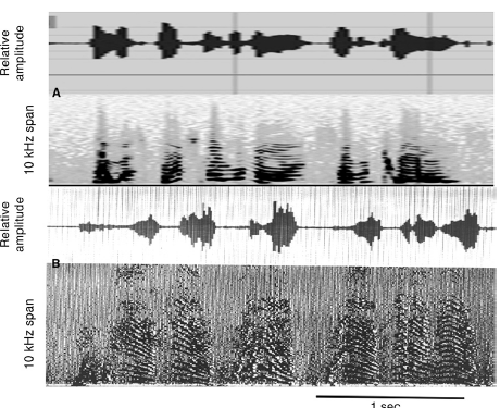
"The amplitude and rhythm of the whale’s sounds were very smilar to that of human speech; here’s a sonogram from the paper showing the resemblance."
Ridgway, S., D. Carder, M. Jeffries, and M. Todd. 2012. Spontaneous speech mimicry of human sounds. Current Biology. Current Biology Vol 22 No 20,  DOI: 10.1016/j.cub.2012.08.044


OUGD403 Design Skills: Alphabet Soup (Task 2)

Noma Bar

For this part of the task, we were asked to questionnaire our "subject", Lizzie. From this questionnaire I've learnt her favourite designer is Noma Bar. So I've conducted research into this designer.


Bar uses alot of simple shapes, minimalistic style to create a simple yet effective image. He often seems to use few colours in his work to achieve the simple minimalistic look, for example, in the image below, it depicts a dog, the largest white shape, and a cat, the smaller black cut out, from the white image, creating the dog's mouth.


I really think I can implement this style into the "Lizzie-font", perhaps, the negative space in the images, such as in a "G", could be shapes of things she enjoys, or even her favourite things. I think I could also replicate the bold, blocky forms from his images in the styles of the letters. 

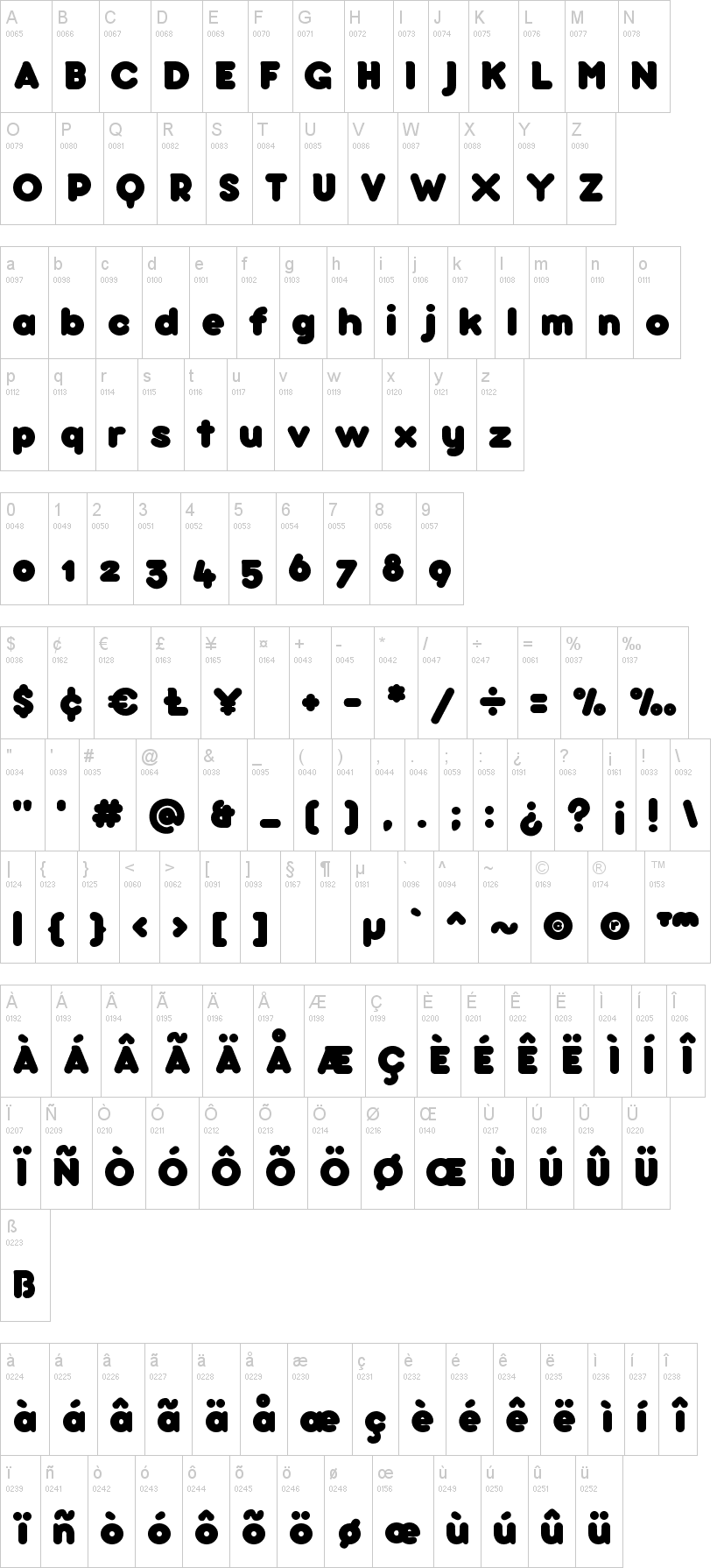
I think the font Bubbleboddy would be good starting point to base the font from, the then adjust the styles and forms of the letters to my liking.


STUDIO BRIEF 1 - VISUAL THINKING - ALPHABET SOUP

Using your newfound appreciation of the anatomy of typographic forms and the wealth of research that you have already gathered, focus on the manipulation of existing letterforms in order to solve this problem. 

My word was Layer.


The image above, the part in blue, shows layers of blue tiles, scattered around, but clustered together to almost make a shape. I think this will be useful for my design work, as I could incorporate this technique in my design work. 


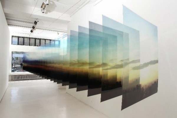
The image above, layers of photographs, stacked on-top of each other, in a perspective-like effect, I hope to implement this into one of my designs.


A lizard, shedding layers of his skin. I thought it may be interesting to include this sort of idea in my work, perhaps creating a letter, shedding a layer of skin, to find a clean layer underneath.


This G is using overlaps, black and white, I've used this style before in previous projects from College and you can create some really complex and interesting. Adding several letters, to the image, to create more shapes and more variations. Creating an almost pattern like effect. I hope to implement this into my design. 


Copyright 2010. All rights reserved.

RSS Feed. This blog is proudly powered by Blogger and uses Modern Clix, a theme by Rodrigo Galindez. Modern Clix blogger template by Introblogger.