Using your newfound appreciation of the anatomy of typographic forms and the wealth of research that you have already gathered, focus on the manipulation of existing letterforms in order to solve this problem.
My word was Layer.
The image above, the part in blue, shows layers of blue tiles, scattered around, but clustered together to almost make a shape. I think this will be useful for my design work, as I could incorporate this technique in my design work.
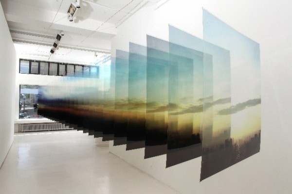
The image above, layers of photographs, stacked on-top of each other, in a perspective-like effect, I hope to implement this into one of my designs.
A lizard, shedding layers of his skin. I thought it may be interesting to include this sort of idea in my work, perhaps creating a letter, shedding a layer of skin, to find a clean layer underneath.
This G is using overlaps, black and white, I've used this style before in previous projects from College and you can create some really complex and interesting. Adding several letters, to the image, to create more shapes and more variations. Creating an almost pattern like effect. I hope to implement this into my design.


Leave your comment